Get to know the page builder user interface
Beta feature
This feature is currently in beta, and should be considered ‘under development’, learn more here.Overview
To help explain how to use page builder, we first thought it appropiate to name some of the key aspects of the user interface, so you’ll know what we’re referring to in our instructions later on.
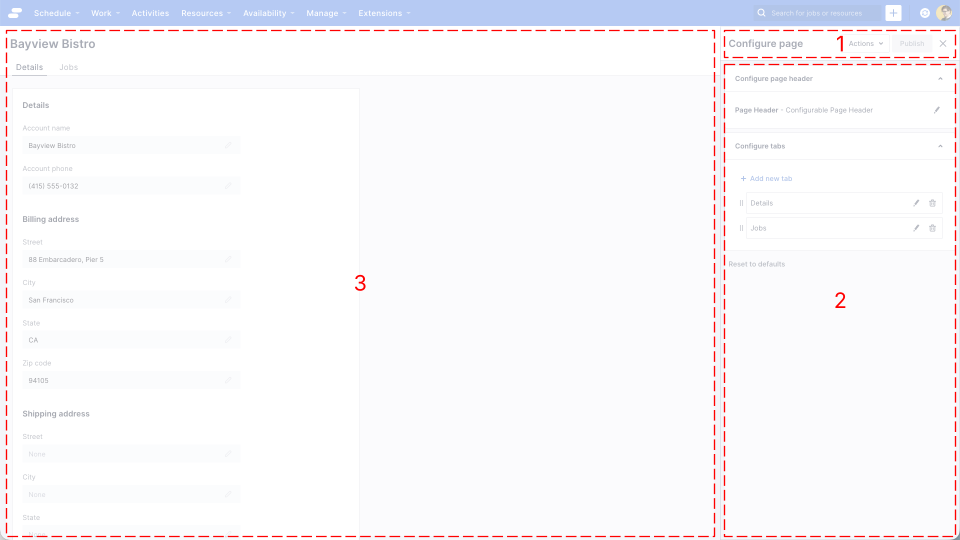
The page builder user interface is comprised of three main elements:
- The header
- The properties panel
- The page preview
The header
The header is always visible when page builder is active. It contains a list of actions you can perform within page builder as well as the “Publish” button.
Actions
There are two actions available:
- Discard changes: This discards any changes since the page was last published, reverting the configuration back to the last published version
- Settings: This displays a page builder settings dialog. Currently, the only setting is “View page using role(s)” which allows you to preview the page for a user with different roles to that of the Administrator.
Publish button
By publishing a page, you are saving your configuration changes, and making them available to all users.
Users will be required to navigate away and back to a page, or refresh the browser in order to see your changes.
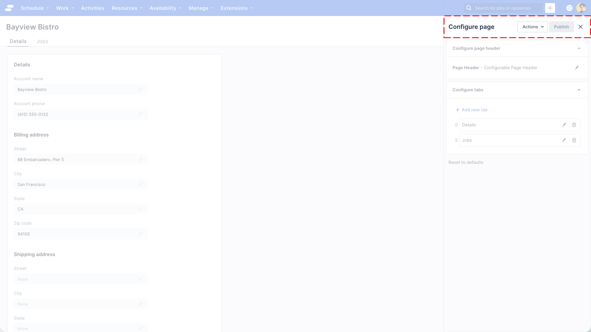
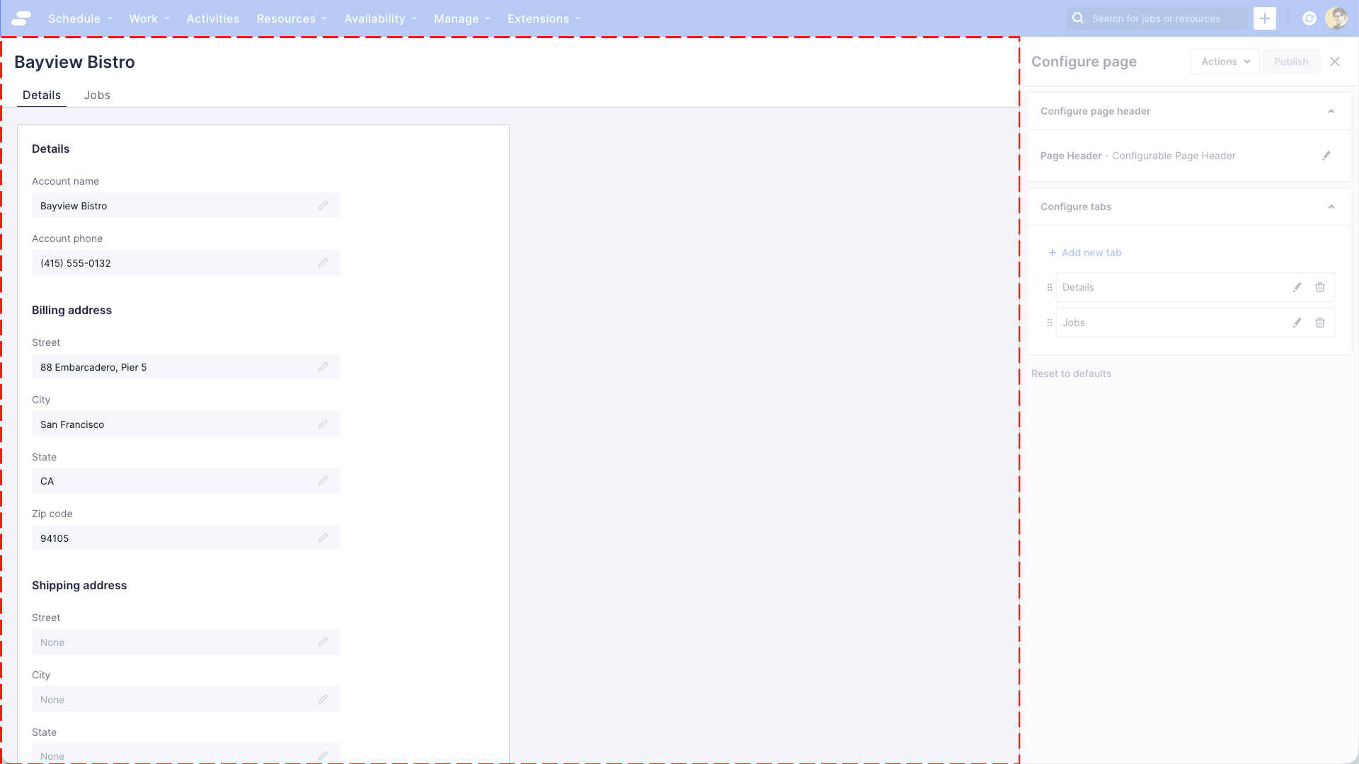
The properties panel
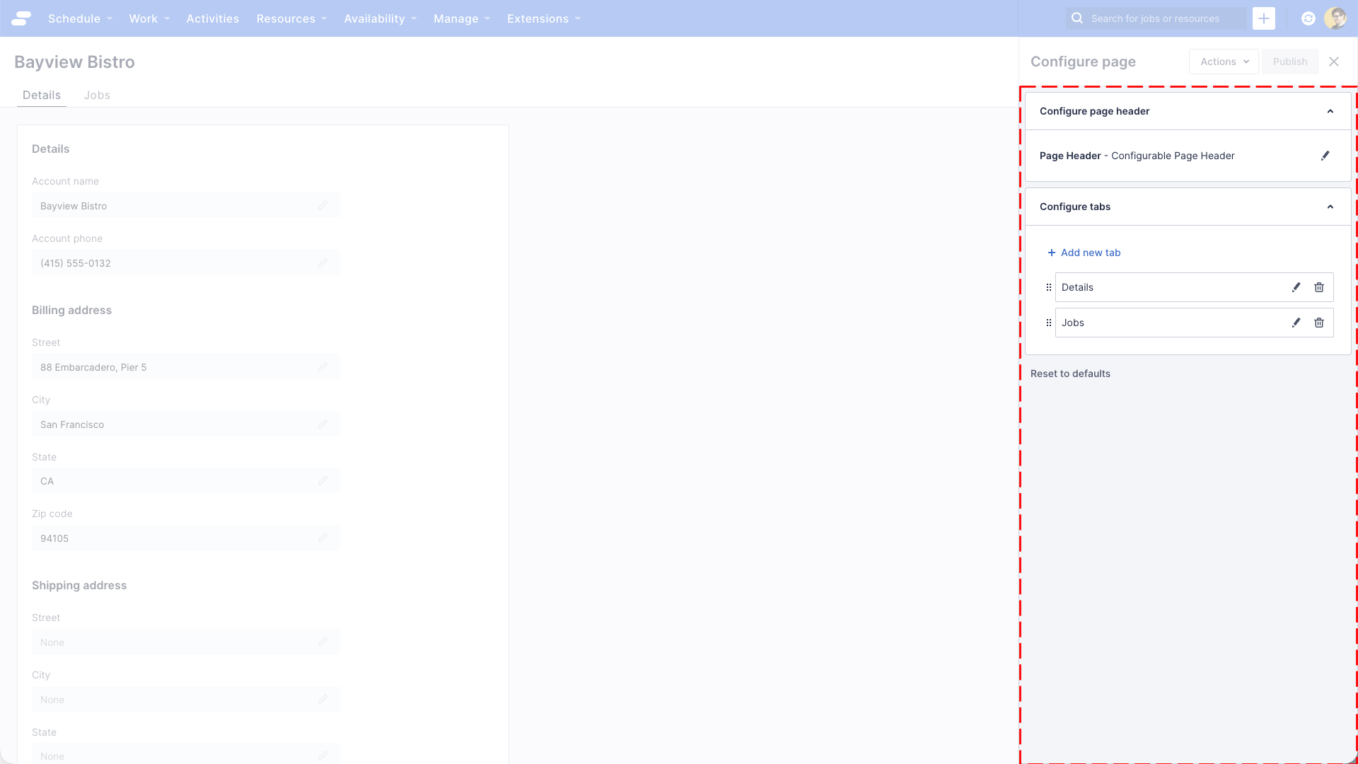
The properties panel shows the components available to configure on a page. For a record detail page, this includes a header, and a tabs component.
When you see the pencil icon, you can click it to edit the properties of a particular component.
For example, if you want to see the properties of the page header, click the pencil icon to the right of the text “Page Header - Configurable Page Header”.
The properties panel will now show the properties for the Configurable Page Header component.
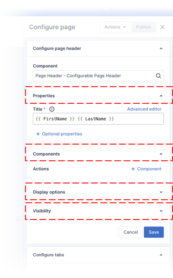
Every component has the following properties broken into categories:
- Properties
- Components (optional)
- Display options
- Visibility
Properties
This section contains properties that a specific to this component, for example, the Page Header component has a Title property that allows you to set the text of the title. Notice there are also Optional properties that you can add by clicking the “+ Optional properties” link, for the Page Header these include Subtitle and Avatar. You can learn more about these in the documentation for Customizing page headers.
Components (optional)
Not all components have this section of properties. Some components can host other components within them, using Page Header component as an example again, it can have a child components that it collectively refers to as “Actions”. By nesting components you can create truly customised experiences for your users.
Display options
In order to control the way components are displayed, every component has a set of common “Display options”.
| Property | Description |
|---|---|
| Display mode | Allows you to control how the component is displayed.
Options:
|
| Width (in columns) | Allows you to control the width of the component.
Options:
|
| Collapsible | Allows you to control whether the component can be collapsed.
Options:
|
Visibility
Sometimes it’s useful to control the visibility of components, such as only showing a collection of fields to users with certain roles, or making sections of a page visible based on records.
| Property | Description |
|---|---|
| Show if |
Use a conditional expression to control the visibility of a component. E.g. By including the expression {{ JobStatus === ‘Queued’ }}, the component will only be visible if the records JobStatus field is “Queued”. |
| Roles with access |
Uses a list of roles to control the visibility of a component. E.g. By selecting “Administrator” and “Scheduler” roles from the drop down, the component will only be visible to users with those roles assigned. |
The page preview
The page preview displays a live view of your page, allowing you to preview changes before publishing them to users.
As you edit and save components using the properties panel, the page preview will let you see and experiment with those changes.
The page preview banner
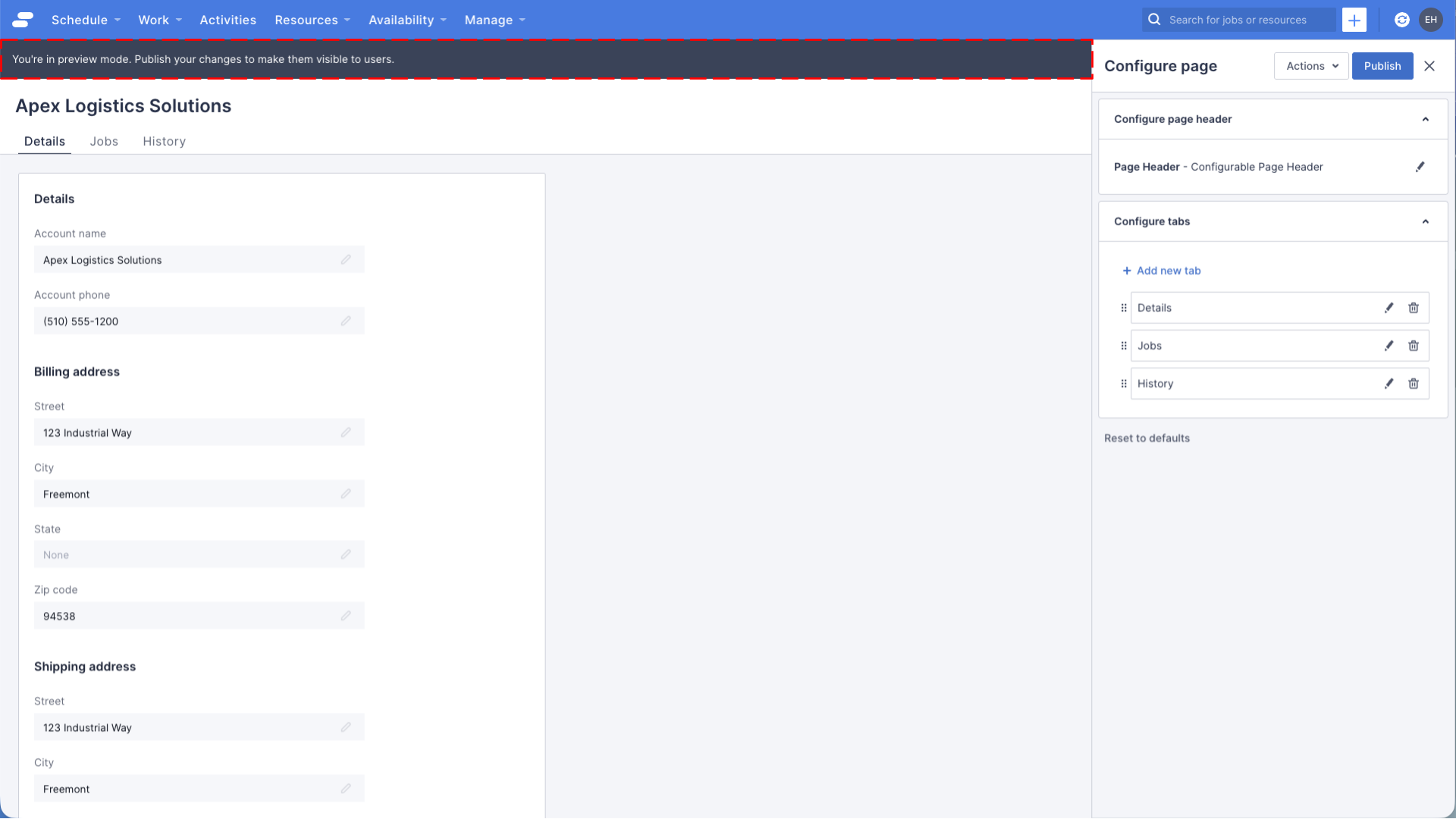
If you have made changes to the page configuration, a banner will appear across the top of the preview area reminding you that you’re in preview mode, and that you need to publish your changes before your users can see them.
Feedback
Was this page helpful?