Set conditional display logic in Form Builder
Overview
Conditional display logic allows you to show or hide components in a Skedulo Plus mobile form based on the values of other components. This feature is useful for creating dynamic forms that adapt to the user’s input.
Currently, conditional logic can only set the visibility of components based on the values of the following components:
- Text input
- Text area
- Toggle
- Drop-down
Understand conditional logic in Form Builder
Conditional logic in mobile forms helps tailor the user experience by showing only the relevant components based on a user’s input. Here’s how it works:
-
When to show: Components appear based on certain conditions. For instance, if a user selects
Yesfor a certain question, another question might appear. -
Set conditions: You can define rules to control when components appear. See this section.
-
Combine conditions: You can also combine conditions using
OrandAnd. See this section.
Add conditional display logic
The following best practices show you how to add conditional display logic.
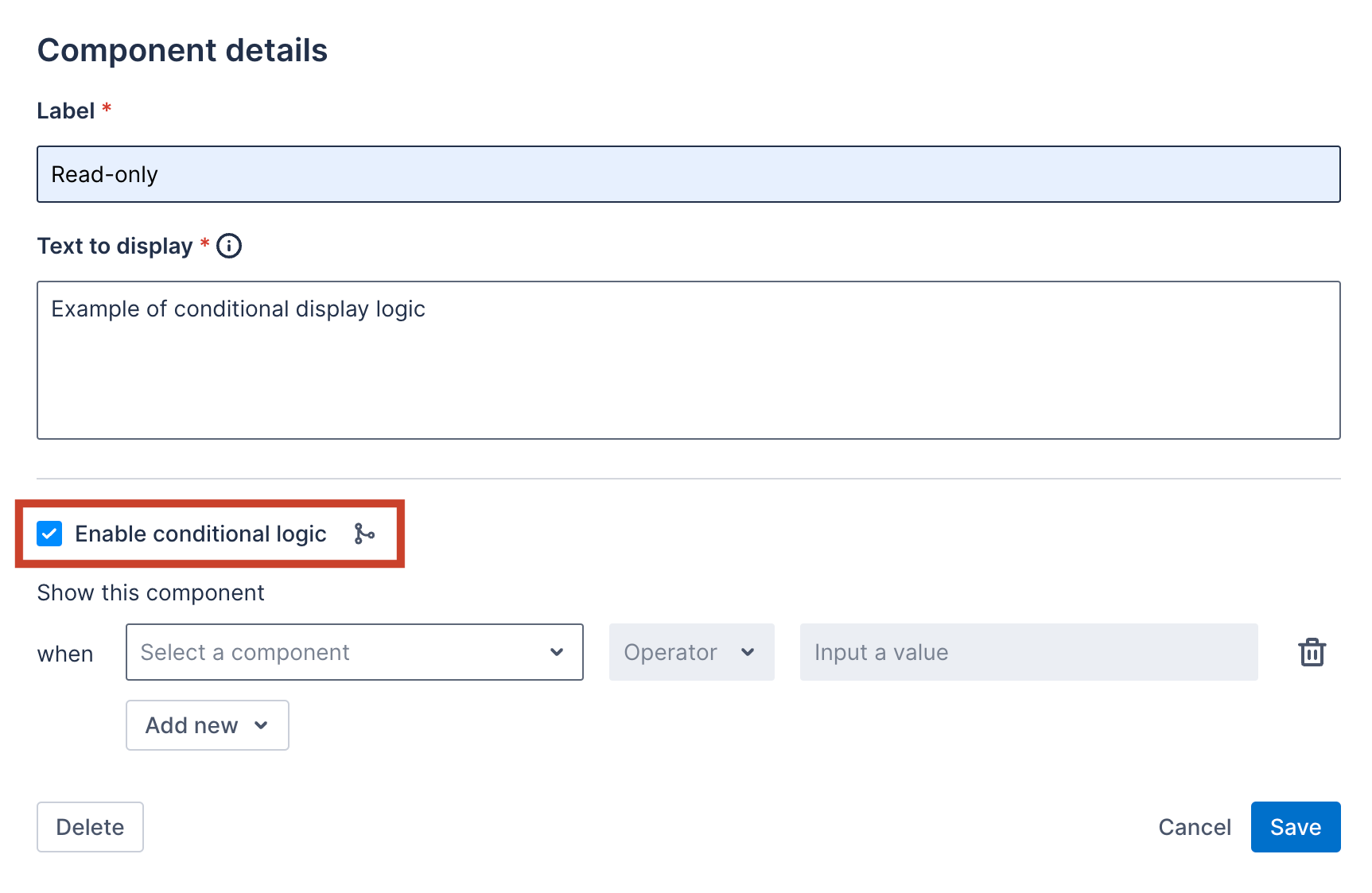
Suppose you add a read-only component to a form and you label it Read-only. To set conditional display logic for this read-only component, select the Enable conditional logic checkbox. The logic editor opens.
Before you begin
To set conditional display logic for a component, you must first add the Text input, Text area, Toggle, or Drop-down components to the form. For more detailed steps on how to add components to a form, refer to this guide.
Set a condition based on the text input or text area components
You can make components appear based on whether a text input or text area field is empty.
Do as follows to set a condition based on the text input or text area components:
-
In the logic editor, select the text input or text area component you want to configure.
-
Select one of the following options:
- Empty: Shows the
Read-onlycomponent if the text input or text area field is left empty. - Not empty: Shows the
Read-onlycomponent if mobile users enter any values in the text input or text area field.
- Empty: Shows the
Set a condition based on the drop-down components
You can make components appear based on drop-down selections.
Do as follows to set a condition based on the user’s interaction with a drop-down component:
-
In the logic editor, select the drop-down component you want to configure.
-
Choose a condition type:
- Equals: Displays the
Read-onlycomponent if mobile users select the specified value. - Not equal to: Displays the
Read-onlycomponent if mobile users select any value except the specified one.
- Equals: Displays the
-
Specify a drop-down value that determines when the component appears.
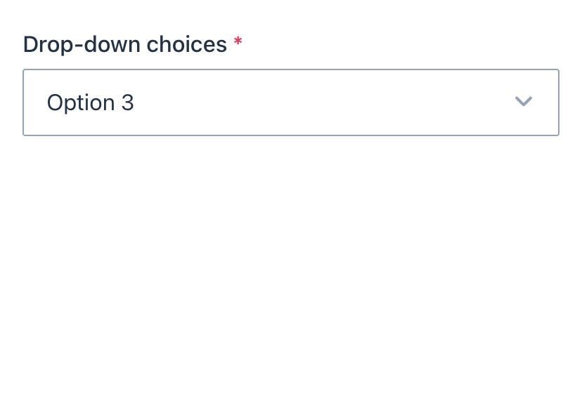
Example 1: Using Equals
Set a condition that will display the Read-only component when the Drop-down choice equals Option 2:
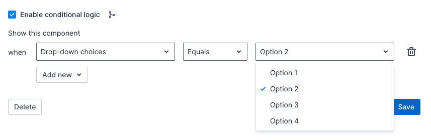
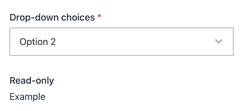
In the mobile app, when a mobile user chooses Option 2, the Read-only component will appear.
Example 2: Using Not equal to
Set a condition that will display the Read-only component when the Drop-down choice not equal to Option 3:
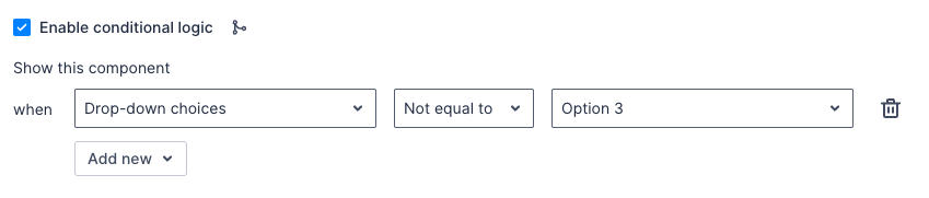
In the mobile app, if a mobile user chooses Option 3, the Read-only component will not appear. It will appear for any other selection.
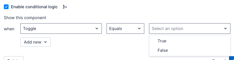
Set a condition based on the toggle components
You can make components appear based on whether a toggle is turned on or off. For example, a text field asking for additional information might only appear if users turn on the toggle.
Do as follows to set a condition based on the state of the toggle component:
-
In the logic editor, select the toggle component you want to configure.
-
Select one of the following options:
- True: Shows the
Read-onlycomponent when mobile users turn on the toggle. - False: Shows the
Read-onlycomponent when mobile users turn off the toggle.
- True: Shows the
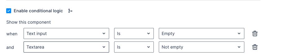
Combine multiple conditions
You can also combine multiple conditions by selecting Add new:
- Use
Andto show a component only if all conditions are met.
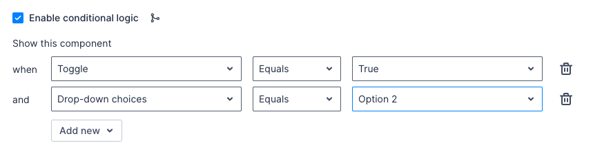
In the example above, the Read-only component will display only if users turn on the toggle and select Option 2 at the same time.
- Use
Orto show a component if any conditions are met.
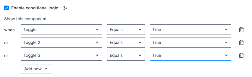
In the example above, the Read-only component will display if users turn on one of the toggles listed in the conditional logic.
Tip
At the end of each condition, you can select the trash bin icon to delete the condition.Feedback
Was this page helpful?