Get to know the automation builder user interface
Beta feature
This feature is currently in beta, and should be considered ‘under development’. Learn about the automations beta.Overview
The automation builder UI has four main elements that are referred to throughout these instructions:
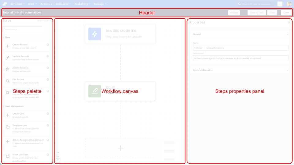
- The header
- The workflow canvas
- The steps palette
- The step properties panel
The header

The header is always visible when you’re editing an automation. It displays the name of the automation, as well as editor actions:
- Close: close the editor, a warning will be displayed if there are unsaved changes
- Save as Draft: save the automation without activating it. Only the automation’s name is validated: step configuration errors don’t block a draft save.
- Activate / Save: the primary action. A new or draft automation shows Activate, which validates the full workflow and makes it live. Once an automation is already Active or Inactive, this button reads Save instead, and validates and saves your changes without changing its status. Any validation errors are shown within the editor.
The workflow canvas
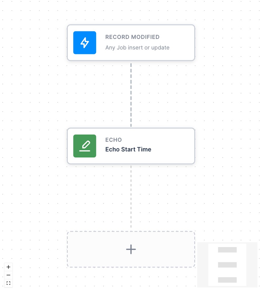
The workflow canvas is where you can select, add or delete steps to the workflow. Each step is represented by a rectangle.
- The Trigger step is always the first step in the workflow, and is colored blue
- Action steps are colored green
- Control steps are colored orange.
There is a toolbar in the bottom left of the canvas that allows you to zoom in or out, or fit the view to see all of the workflow.
There is a mini-map of the workflow in the bottom right of the canvas, that gives an overview of what part of the workflow you are looking at.
The steps palette
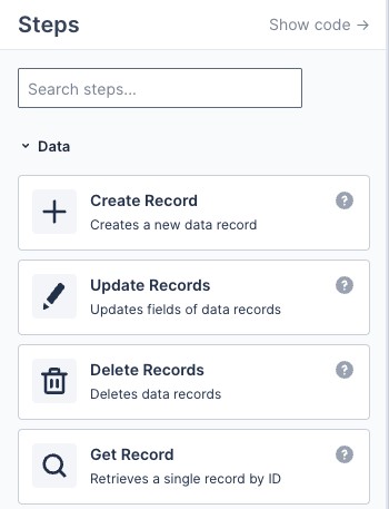
The steps palette allows you to explore what steps are available to be added to your workflow. The steps palette is always visible, docked to the left of the workflow canvas.
From the steps palette you can:
- Get some basic information about a step by hovering over the help icon
- Drag an action from the palette to the workflow canvas, and add it to the workflow
- Search the available steps using the search box at the top of the palette
- Collapse/expand groups of steps by clicking on the group title
The step properties panel
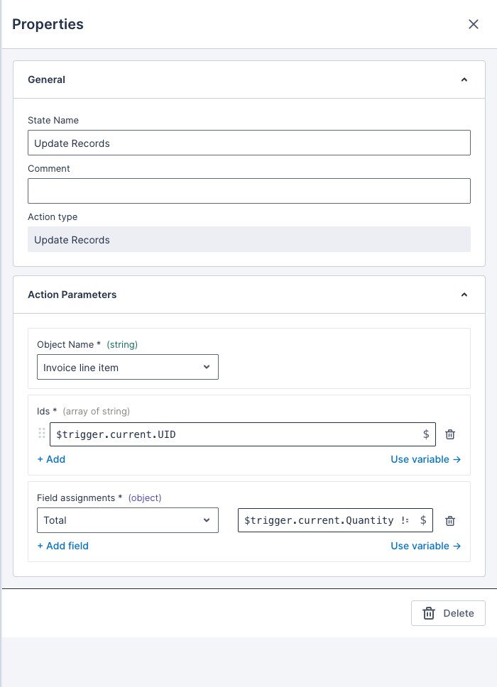
The step properties panel is where you can edit properties of the automation, such as its name and description, or the properties of a selected step, for example a trigger or action.
To edit the properties of the automation, click anywhere on the background of the workflow canvas.
To edit the properties of a step, click the step and the properties panel will update to show the properties of the selected step.
Workflow variables picker
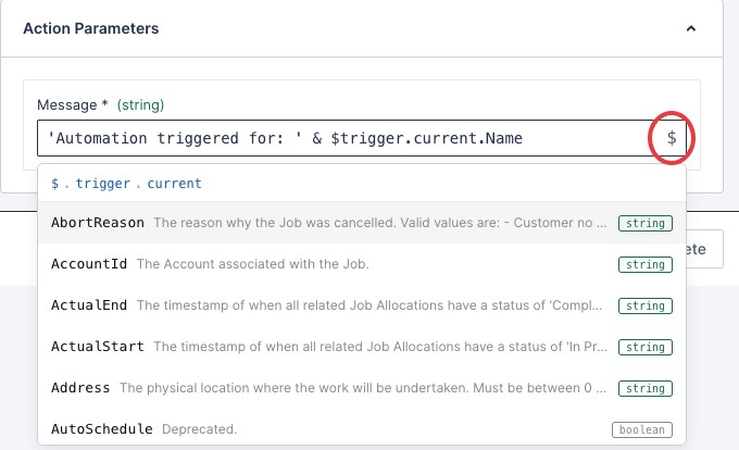
When you are editing the properties of an action or control flow step, you are able to access the workflow variables available to that step by clicking the $ icon, or typing the $ character into the field for the parameter.
The variables are displayed as a tree, where each previous step in the workflow can be examined and used by the action.
Step input fields accept JSONata expressions, so you can do more than just reference a variable: you can combine fields, format strings, and evaluate conditions inline. See JSONata expressions for a full reference.
See also
Feedback
Was this page helpful?