Override the default View record page
Once you have added some records using your Create record page, you might want to update the View record page so that your data is presented in a more useful way.
This article covers some of the ways in which you can override the arcade-games-view page that was auto-generated when we created the Arcade Games object. All of the components that you can use to customize your pages can be found in the Design System documentation.
The default page
The default arcade-games-view page that was generated for the Arcade Games object contains two elements:
{% extends "base-recordview" %}
{% set resource_name="Arcade Games" %}
As covered in the system-generated pages article, this means that the arcade-games-view page inherits properties from the base-recordview page, and defines the name of the resource.
On the base-recordview page, the content is split into header, body, and footer blocks. To change the content within any of these blocks, you need to add the relevent tags to your page and then add the components you want to include between them.
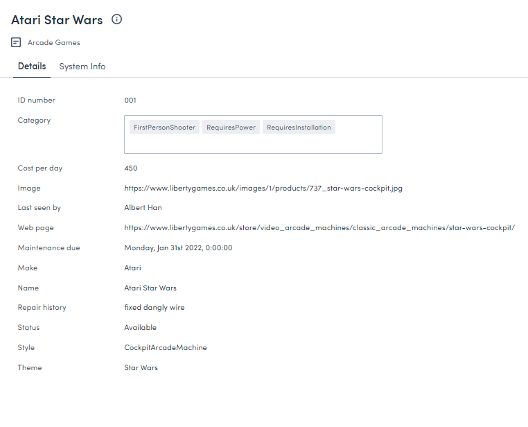
Before overriding any of the default page’s content, the following page is rendered in Skedulo Platform:
This article will take you through the process of configuring the default arcade-games-view page so that it renders in a more user-friendly way.
Locate the default page
To locate the default page:
- Click Settings > Developer tools > Platform settings (beta) to display the Platform page.
- Locate the
arcade-games-viewpage in the list. Use the filter and sort options if necessary. - Click the page’s Name to open its edit page.
Override the header
The content of the header in the View record page is defined by the header block in the base-recordview page:
{% block header %}
  <brz-page-header>
    <brz-row slot="title">
      <brz-heading size="2xl" level="1">
        {% block title %}
          <platform-component package-name="recordpage" name="RecordDefiner"></platform-component>
        {% endblock title %}
      </brz-heading>
    </brz-row>
    <brz-row slot="subtitle">
      <brz-icon icon="details"></brz-icon>
      <span>{{resource_name}}</span>
    </brz-row>
  </brz-page-header>
{% endblock header %}
You can override any of the details in this block by adding the {% block header %}{% endblock header %} tags to your page beneath the resource_name element. Enter the components you want to include in your header between these header tags.
Important
You will need to enter all the elements of the header block you want to include even if you only want to override one part. For example, looking at the above code block, even if you only want to change the title, you will still need to add the elements that render the subtitle, icon, and style or they won’t be included on the page.Update the title, subtitle, and icon
The title of the View record page is generated from the RecordDefiner component that is located between the title tags. If there is a name or Name field associated with your object, then the RecordDefiner component pulls the title from there. If there are neither of these fields on your object, the RecordDefiner will pull in the UID.
In this example, we don’t want to change the title because the Arcade Games object has a Name field for the RecordDefiner component to reference, but as we are making other changes to the header, we’ll still need to add the component to the arcade-games-view page.
The subtitle is between the span tags. Change this to Machine record
We don’t want to make any changes to the icon, so we can add that line to the page exactly as it appears in the base page.
{% block header %}
  <brz-page-header>
    <brz-row slot="title">
      <brz-heading size="2xl" level="1">
        {% block title %}
          <platform-component package-name="recordpage" name="RecordDefiner"></platform-component>
        {% endblock title %}
      </brz-heading>
    </brz-row>
    <brz-row slot="subtitle">
      <brz-icon icon="details"></brz-icon>
      <span>Machine record</span>
    </brz-row>
  </brz-page-header>
{% endblock header %}
Change the color
To change the color of the title and subtitle to, for example, match the brand palette of our fictional Arcade Games company, you need to add a color token (var(--brz-color...)) to the page. In this example, we will add a color token to both brz-row components so that the color of the title and subtitle render in purple.
{% block header %}
  <brz-page-header>
    <brz-row style="color: var(--brz-color-purple-900)" slot="title">
      <brz-heading size="2xl" level="1">
        {% block title %}
          <platform-component package-name="recordpage" name="RecordDefiner"></platform-component>
        {% endblock title %}
      </brz-heading>
    </brz-row>
    <brz-row style="color: var(--brz-color-purple-700)" slot="subtitle">
      <brz-icon icon="details"></brz-icon>
      <span>Machine record</span>
    </brz-row>
  </brz-page-header>
{% endblock header %}
For more information and a list of the available colors, see the Color section in the Design System documentation.
Add an avatar
To add an avatar to the header and stay consistent with the Create record page, add the brz-avatar component below the brz-page-header. As before, use the image-src property and provide a relative or absolute URL to an image file. For best results it should be an exact square of 130px width and height because this component does not resize, crop, or otherwise transform images.
{% block header %}
  <brz-page-header>
    <brz-avatar size="large" theme="solid" label="Arcade Machines" image-src="https://cdn.discordapp.com/attachments/790575952487776296/1092737084873256970/arcade_games.jpg" slot="decorator">
    </brz-avatar>
    <brz-row style="color: var(--brz-color-purple-900)" slot="title">
      <brz-heading size="2xl" level="1">
        {% block title %}
          <platform-component package-name="recordpage" name="RecordDefiner"></platform-component>
        {% endblock title %}
      </brz-heading>
    </brz-row>
    <brz-row style="color: var(--brz-color-purple-700)" slot="subtitle">
      <brz-icon icon="details"></brz-icon>
      <span>Machine record</span>
    </brz-row>
  </brz-page-header>
{% endblock header %}
For more information about avatars, refer to the Avatar section in the Design System documentation.
Add a button
Add an Edit button to your View record page header to make it easier to edit your records.
For this example, we are going to add a primary button type which will open the currently selected record’s Edit record page. To add this button, add the brz-button component to your header block, and then within this component, add the page you want to open. For example:
<brz-button slot="actions" element="a" button-type="primary" href="/platform/page/arcade-games-edit?uid={{uid}}">Edit record</brz-button>
If we add this component to our header block, it looks as follows:
{% block header %}
<brz-page-header>
  <brz-avatar size="large" theme="solid" label="Arcade Machines" image-src="https://cdn.discordapp.com/attachments/790575952487776296/1092737084873256970/arcade_games.jpg" slot="decorator">
    </brz-avatar>
  <brz-row style="color: var(--brz-color-purple-900)" slot="title">
    <brz-heading size="2xl" level="1">
      {% block title %}
        <platform-component package-name="recordpage" name="RecordDefiner"></platform-component>
      {% endblock title %}
    </brz-heading>
  </brz-row>
  <brz-row style="color: var(--brz-color-purple-700)" slot="subtitle">
    <brz-icon icon="details"></brz-icon>
    <span>Machine record</span>
  </brz-row>
  <brz-button slot="actions" element="a" button-type="primary" href="/platform/page/arcade-games-edit?uid={{uid}}">Edit record</brz-button>
</brz-page-header>
{% endblock header %}
A list of the available button components can be found in our Design System documentation.
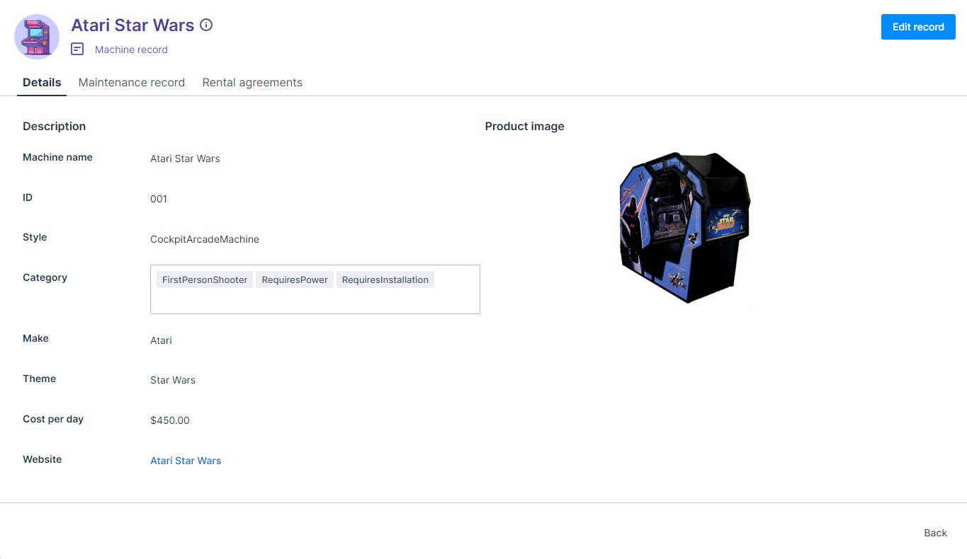
With these few changes, the header of the View record page now renders as follows:
Override the body
The main body of the View record page is defined by the body block in the base-recordview page.
{% block body %}
  <brz-tabs>
    <brz-tab slot="tabs" name="details">Details</brz-tab>
    <brz-tab slot="tabs" name="system-info">System Info</brz-tab>
    <brz-tab-panel name="details">
      <brz-responsive-columns>
        <div>
          <platform-component package-name="recordpage" name="RecordFields" include-fields="{{ include_fields }}" exclude-fields="{{ exclude_fields }}" exclude-system-fields></platform-component>
        </div>
      </brz-responsive-columns>
    </brz-tab-panel>
    <brz-tab-panel name="system-info">
      <brz-responsive-columns>
        <div>
          <platform-component package-name="recordpage" name="RecordFields" only-system-fields></platform-component>
        </div>
      </brz-responsive-columns>
    </brz-tab-panel>
  </brz-tabs>
{% endblock body %}
To override the appearance of the content in the body of the View record page, add the {% block body %} and {% endblock body %} tags to your arcade-games-view page below the header block and then rebuild the body with the components you want to include.
Important
You will need to add all the components of the body block that you want to include even if you only want to override one part. For example, you must add all fields to the page even if you only want to edit one.Configure the layout
To maintain consistancy with the Create record page, we will reorder the fields on the View record page. Add each field you want to include using the brz-record-field component.
<dl>
  <brz-record-field label-postion="side">
    <dt slot='label'>Machine name</dt>
    <dd><platform-component package-name="recordpage" name="RecordFieldView" field-name="name"></platform-component></dd>
  </brz-record-field>
</dl>
- Add the
label-postionattribute to thebrz-record-fieldcomponent in order to set whether the label appears to thesideor on thetopof the value. - The
dt slot="label"element defines the label for the field. - The
ddelement defines which field on your record the data is pulled from. Thefield-namevalue must exactly match the Field name value you entered on the Create Custom Field modal when you created your custom fields.
Finally, once all fields are added, wrap them with the dl element. For example:
{% block body %}

<dl>
  <brz-record-field label-position="side">
    <dt slot="label">Machine name</dt>
    <dd><platform-component package-name="recordpage" name="RecordFieldView" field-name="name"></platform-component></dd>
  </brz-record-field>

  <brz-record-field label-position="side">
    <dt slot="label">ID</dt>
    <dd><platform-component package-name="recordpage" name="RecordFieldView" field-name="Id"></platform-component></dd>
  </brz-record-field>

  <brz-record-field label-position="side">
    <dt slot="label">Style</dt>
    <dd><platform-component package-name="recordpage" name="RecordFieldView" field-name="style"></platform-component></dd>
  </brz-record-field>

  <brz-record-field label-position="side">
    <dt slot="label">Category</dt>
    <dd><platform-component package-name="recordpage" name="RecordFieldView" field-name="category"></platform-component></dd>
  </brz-record-field>

  <brz-record-field label-position="side">
    <dt slot="label">Make</dt>
    <dd><platform-component package-name="recordpage" name="RecordFieldView" field-name="make"></platform-component></dd>
  </brz-record-field>

  <brz-record-field label-position="side">
    <dt slot="label">Theme</dt>
    <dd><platform-component package-name="recordpage" name="RecordFieldView" field-name="theme"></platform-component></dd>
  </brz-record-field>

  <brz-record-field label-position="side">
    <dt slot="label">Cost per day</dt>
    <dd><platform-component package-name="recordpage" name="RecordFieldView" field-name="costperday"></platform-component></dd>
  </brz-record-field>

  <brz-record-field label-position="side">
    <dt slot="label">Website</dt>
    <dd><platform-component package-name="recordpage" name="RecordFieldView" field-name="linkurl"></platform-component></dd>
  </brz-record-field>

  <brz-record-field label-position="side">
    <dt slot="label">Image</dt>
    <dd><platform-component package-name="recordpage" name="RecordFieldView" field-name="imageurl"></platform-component></dd>
  </brz-record-field>
</dl>
{% endblock body %}
Note: The Maintenance due, Repair history, Last seen by, and Status fields will be added later. They are going to be displayed on a different tab when we create the tabbed display.
Split the page into columns
We’ve added the fields in the order we want them to appear, but they are currently displayed in one column, which is aligned to the edge of the page. To split the page into two columns, add the <brz-responsive-columns> element to the body block. Next, use <div> elements to split the fields into two blocks. In this case, we want the image to be displayed on the right, with the details on the left
{% block body %}
<brz-responsive-columns>
  <div>
    <dl>
      <brz-record-field label-position="side">
        <dt slot="label">Machine name</dt>
        <dd><platform-component package-name="recordpage" name="RecordFieldView" field-name="name"></platform-component></dd>
      </brz-record-field>

      <brz-record-field label-position="side">
        <dt slot="label">ID</dt>
        <dd><platform-component package-name="recordpage" name="RecordFieldView" field-name="Id"></platform-component></dd>
      </brz-record-field>

      <brz-record-field label-position="side">
        <dt slot="label">Style</dt>
        <dd><platform-component package-name="recordpage" name="RecordFieldView" field-name="style"></platform-component></dd>
      </brz-record-field>

      <brz-record-field label-position="side">
        <dt slot="label">Category</dt>
        <dd><platform-component package-name="recordpage" name="RecordFieldView" field-name="category"></platform-component></dd>
      </brz-record-field>

      <brz-record-field label-position="side">
        <dt slot="label">Make</dt>
        <dd><platform-component package-name="recordpage" name="RecordFieldView" field-name="make"></platform-component></dd>
      </brz-record-field>

      <brz-record-field label-position="side">
        <dt slot="label">Theme</dt>
        <dd><platform-component package-name="recordpage" name="RecordFieldView" field-name="theme"></platform-component></dd>
      </brz-record-field>

      <brz-record-field label-position="side">
        <dt slot="label">Cost per day</dt>
        <dd><platform-component package-name="recordpage" name="RecordFieldView" field-name="costperday"></platform-component></dd>
      </brz-record-field>

      <brz-record-field label-position="side">
        <dt slot="label">Website</dt>
        <dd><platform-component package-name="recordpage" name="RecordFieldView" field-name="linkurl"></platform-component></dd>
      </brz-record-field>

      <brz-record-field label-position="side">
        <dt slot="label">Image</dt>
        <dd><platform-component package-name="recordpage" name="RecordFieldView" field-name="imageurl"></platform-component></dd>
      </brz-record-field>
    </dl>
  </div>
</brz-responsive-columns>
{% endblock body %}
Add an image
Currently, the image URL doesn’t resolve into an image on the View record page. To do this, you need to replace the RecordFieldView platform component with the RecordTemplate component.
<platform-component package-name="recordpage" name="RecordTemplate" template="{{ '<img src="{{imageurl}}" alt="{{name}}" width="200" height="200" />' }}"></platform-component>
For the img src component, enter the field name where the image URL is entered, which in this case is the imageurl custom field we created in the first step. This value must exactly match the Field name value you entered on the Create Custom Field modal when you created your custom fields.
Additionally, we can remove the dt slot="label" tags because we don’t need a label for the image.
<brz-record-field>
  <platform-component package-name="recordpage" name="RecordTemplate" template="{{ '<img src="{{imageurl}}" alt="{{name}}" width="200" height="200" />' }}"></platform-component>
</brz-record-field>
Add a hyperlink
Currently, the link to the website isn’t clickable. In order to correct this, replace the RecordFieldView platform component with the RecordTemplate component. For the brz-link href component, enter the name of the field where you enter the link, which in this case is the linkurl custom field we created at the start. This value must match the Field name value you entered on the Create Custom Field modal when you created your custom fields. The text used for the hyperlink pulls in the name field.
<platform-component package-name="recordpage" name="RecordTemplate" template="{{ '<brz-link href="{{ linkurl }}"> {{ name }} </brz-link>' }}"></platform-component>
The brz-record-field component for the linkurl field now looks as follows:
<brz-record-field label-position="side">
  <dt slot="label">Website</dt>
  <dd><platform-component package-name="recordpage" name="RecordTemplate" template="{{ '<brz-link href="{{ linkurl }}"> {{ name }} </brz-link>' }}"></platform-component></dd>
</brz-record-field>
Add number formatting
To modify the costperday field so that the value is displayed as a decimal and with a currency symbol, replace the RecordFieldView platform component with the RecordTemplate component and specify the denomination and number of decimal places in the template value. For example:
<platform-component package-name="recordpage" name="RecordTemplate" template="{{ '${{costperday |number (decimals=2)}}' }}"></platform-component>
The brz-record-field component for the costperday field now looks as follows:
<brz-record-field>
  <dt>Cost per day</dt>
  <dd><platform-component package-name="recordpage" name="RecordTemplate" template="{{ '${{costperday |number (decimals=2)}}' }}"></platform-component></dd>
</brz-record-field>
Add headings
Headings can be added to group the fields into sections. To add headings to the body block, use the brz-heading element. In this example, we are going to add two headings, one at the top of each column.
{% block body %}
<brz-responsive-columns>
      <div>
        <brz-heading size="base" style="margin-bottom: var(--brz-spacing-4)">Description</brz-heading>
        <dl>
          <brz-record-field label-position="side">
            <dt slot="label">Machine name</dt>
            <dd><platform-component package-name="recordpage" name="RecordFieldView" field-name="name"></platform-component></dd>
          </brz-record-field>

          <brz-record-field label-position="side">
            <dt slot="label">ID</dt>
            <dd><platform-component package-name="recordpage" name="RecordFieldView" field-name="Id"></platform-component></dd>
          </brz-record-field>

          <brz-record-field label-position="side">
            <dt slot="label">Style</dt>
            <dd><platform-component package-name="recordpage" name="RecordFieldView" field-name="style"></platform-component></dd>
          </brz-record-field>

          <brz-record-field label-position="side">
            <dt slot="label">Category</dt>
            <dd><platform-component package-name="recordpage" name="RecordFieldView" field-name="category"></platform-component></dd>
          </brz-record-field>

          <brz-record-field label-position="side">
            <dt slot="label">Make</dt>
            <dd><platform-component package-name="recordpage" name="RecordFieldView" field-name="make"></platform-component></dd>
          </brz-record-field>

          <brz-record-field label-position="side">
            <dt slot="label">Theme</dt>
            <dd><platform-component package-name="recordpage" name="RecordFieldView" field-name="theme"></platform-component></dd>
          </brz-record-field>

          <brz-record-field label-position="side">
            <dt slot="label">Cost per day</dt>
            <dd><platform-component package-name="recordpage" name="RecordTemplate" template="{{ '${{costperday |number (decimals=2)}}' }}"></platform-component></dd>
          </brz-record-field>

          <brz-record-field label-position="side">
            <dt slot="label">Website</dt>
            <dd><platform-component package-name="recordpage" name="RecordTemplate" template="{{ '<brz-link href="{{ linkurl }}"> {{ name }} </brz-link>' }}"></platform-component></dd>
          </brz-record-field>
          </dl>
      </div>

      <div>
        <brz-heading size="base" style="margin-bottom: var(--brz-spacing-4)">Product image</brz-heading>
        <brz-record-field>
          <platform-component package-name="recordpage" name="RecordTemplate" template="{{ '<img src="{{imageurl}}" alt="{{name}}" width="200" height="200" />' }}"></platform-component>
        </brz-record-field>
      </div>
    </brz-responsive-columns>
{% endblock body %}
Add tabs
The default View record page is divided into two tabs in order to separate the editable content and the un-editable system information. We don’t want to view the system information in this case, but we still want the tabbed view so we can separate the machine details and the maintenance record. We are also going to add a third tab which will link to another object.
The tabs will contain the following information:
- Tab one, Details, will include the
name,Id,style,category,make,theme,costperday,linkurl, andimageurlfields. - Tab two, Maintenance record, will include the
maintenancedue,repairhistory,lastseenby, andstatusfields. These rows will need adding to the page. - Tab three, Rental agreements, will link to a second object. For now, this tab is empty. Content will be added in linking to data from a related object.
To create the tabbed layout, add:
- the
brz-tabscomponent to add tabs to the page. - the
brz-tabcomponent to identify the tabs. - the
brz-tab-panelcomponent to group the content of a tab.
Add shown to the brz-tab-panel component that you want to be displayed by default when opening a View record page. In this example, we want the Details tab to be opened by default.
<brz-tab-panel name="details" shown>
In the page, this will look as follows:
{% block body %}

<brz-tabs>
   <brz-tab slot="tabs" name="details">Details</brz-tab>
   <brz-tab slot="tabs" name="maintenance-record">Maintenance record</brz-tab>
   <brz-tab slot="tabs" name="rental-agreement">Rental agreements</brz-tab>

  <brz-tab-panel name="details" shown>
    <brz-responsive-columns>
      <div>
        <brz-heading size="base" style="margin-bottom: var(--brz-spacing-4)">Description</brz-heading>
        <dl>
          <brz-record-field label-position="side">
            <dt slot="label">Machine name</dt>
            <dd><platform-component package-name="recordpage" name="RecordFieldView" field-name="name"></platform-component></dd>
          </brz-record-field>

          <brz-record-field label-position="side">
            <dt slot="label">ID</dt>
            <dd><platform-component package-name="recordpage" name="RecordFieldView" field-name="Id"></platform-component></dd>
          </brz-record-field>

          <brz-record-field label-position="side">
            <dt slot="label">Style</dt>
            <dd><platform-component package-name="recordpage" name="RecordFieldView" field-name="style"></platform-component></dd>
          </brz-record-field>

          <brz-record-field label-position="side">
            <dt slot="label">Category</dt>
            <dd><platform-component package-name="recordpage" name="RecordFieldView" field-name="category"></platform-component></dd>
          </brz-record-field>

          <brz-record-field label-position="side">
            <dt slot="label">Make</dt>
            <dd><platform-component package-name="recordpage" name="RecordFieldView" field-name="make"></platform-component></dd>
          </brz-record-field>

          <brz-record-field label-position="side">
            <dt slot="label">Theme</dt>
            <dd><platform-component package-name="recordpage" name="RecordFieldView" field-name="theme"></platform-component></dd>
          </brz-record-field>

          <brz-record-field label-position="side">
            <dt slot="label">Cost per day</dt>
            <dd><platform-component package-name="recordpage" name="RecordTemplate" template="{{ '${{costperday |number (decimals=2)}}' }}"></platform-component></dd>
          </brz-record-field>

          <brz-record-field label-position="side">
            <dt slot="label">Website</dt>
            <dd><platform-component package-name="recordpage" name="RecordTemplate" template="{{ '<brz-link href="{{ linkurl }}"> {{ name }} </brz-link>' }}"></platform-component></dd>
          </brz-record-field>
        </dl>
      </div>

      <div>
        <brz-heading size="base" style="margin-bottom: var(--brz-spacing-4)">Product image</brz-heading>
        <brz-record-field label-position="side">
          <platform-component package-name="recordpage" name="RecordTemplate" template="{{ '<img src="{{imageurl}}" alt="{{name}}" width="200" height="200" />' }}"></platform-component>
        </brz-record-field>
      </div>
    </brz-responsive-columns>
  </brz-tab-panel>

  <brz-tab-panel name="maintenance-record">
    <brz-responsive-columns>
      <div>
       <dl>
         <brz-record-field label-position="side">
            <dt slot="label">Maintenance due</dt>
            <dd><platform-component package-name="recordpage" name="RecordFieldView" field-name="maintenancedue"></platform-component></dd>
         </brz-record-field>

          <brz-record-field label-position="side">
            <dt slot="label">Repair history</dt>
            <dd><platform-component package-name="recordpage" name="RecordFieldView" field-name="repairhistory"></platform-component></dd>
          </brz-record-field>

          <brz-record-field label-position="side">
            <dt slot="label">Last seen by</dt>
            <dd><platform-component package-name="recordpage" name="RecordFieldView" field-name="lastseenby"></platform-component></dd>
          </brz-record-field>

          <brz-record-field label-position="side">
            <dt slot="label">Status</dt>
            <dd><platform-component package-name="recordpage" name="RecordFieldView" field-name="status"></platform-component></dd>
          </brz-record-field>
         </dl>
      </div>
    </brz-responsive-columns>
  </brz-tab-panel>

  <brz-tab-panel name="rental-agreement">
  </brz-tab-panel>
</brz-tabs>

{% endblock body %}
With all the changes made so far, the View record page is now much nicer to look at:
Reflective tabs
To link users directly to a specific tab, you can use the ReflectiveTabs component.
This component enables you to not only add tabs to your page, like the brz-tabs componenet, but also build a URL that will take a user to a specific tab. This means you can link users directly to relevant data.
For example, with the brz-tabs component that we used above to add tabs, the URL for a tabbed record page would be:
.../platform/page/arcade-games-view?uid=05a2e2f1-096a-432d-a66e-b86c9aac8b87
But, if you create tabs using the ReflectiveTabs component, the URL could look as follows, with the tab name at the end:
.../platform/page/arcade-games-view?uid=05a2e2f1-096a-432d-a66e-b86c9aac8b87&selectedtab=details
In order to use this component, add the following to the body block, replacing the first four lines of the block that we added in the Adding tabs section above:
<brz-tabs selected="{{_.queryParams.selectedtab}}">
  <platform-component package-name="nav" name="ReflectiveTabs" search-param="selectedtab"
  tabs="{{  [
              {"name":"details","label":"Details"},
              {"name":"maintenance-record","label":"Maintenance record"},
              {"name":"rental-agreement","label":"Rental agreements"}
            ]   |dump}}">
  </platform-component>
The first line, <brz-tabs selected=" {{_.queryParams.selectedtab}}"> , establishes the query, so you need to ensure that the value entered matches the search-param value used in the next line.
The search-param value can be anything you want. For this example, we’ve used selectedtab.
Within the ReflectiveTabs component, add the names and labels of the individual tabs.
- The Name is used internally, and must match the value of the
brz-tab-panelcomponent. - The Label is what will be visible on the tab. It should match the label you use for the tab in the
brz-tab-panelcomponent.
Link to data from a related object
The third tab in the View record page will display data from another object.
Before linking to an object, we need to create it. Create a new custom object called Rental agreements and populate it with the following fields:
- Reference – Enter a unique reference number.
- Account – Select a customer account to link the machine to.
- Arcade Machine – Select the machine covered by the agreement.
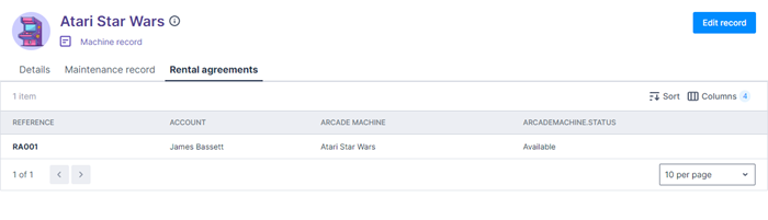
To link to this object in the arcade-games-view page, add the following recordpage component to the <brz-tab-panel name="rental-agreement"> component at the bottom of the page. This pulls in the data from the Rental agreement object, automatically filters it so that only the agreements relevant to the current machine are displayed, and presents the information in a list view on your Rental agreement tab.
<brz-tab-panel name="rental-agreement">
  <div>
    <platform-component
      package-name="recordpage"
      name="RecordTemplate"
      template=" {{ '{% if UID %}
        <platform-eventbus-scope closed>
          <platform-component package-name="listview"
            name="RelatedListView"
            resource-name="Rentalagreement"
            foreign-key="ArcademachineId"
            foreign-key-value="{{UID}}">
          </platform-component>
        </platform-eventbus-scope>
      {% endif %}' }}" >
    </platform-component>
  </div>
</brz-tab-panel>
For more information about the recordpage horizon component package, refer to the Platform Record Page section in Storybook.
Completed code
If you’ve gone through all the steps in this article, your completed page template should look as follows:
{% extends "base-recordview" %}
{% set resource_name="Arcade Games" %}

{% block header %}
<brz-page-header>
  <brz-avatar size="large" theme="solid" label="Arcade Machines" image-src="https://cdn.discordapp.com/attachments/790575952487776296/1092737084873256970/arcade_games.jpg" slot="decorator">
    </brz-avatar>
  <brz-row style="color: var(--brz-color-purple-900)" slot="title">
    <brz-heading size="2xl" level="1">
      {% block title %}
        <platform-component package-name="recordpage" name="RecordDefiner"></platform-component>
      {% endblock title %}
    </brz-heading>
  </brz-row>
  <brz-row style="color: var(--brz-color-purple-700)" slot="subtitle">
    <brz-icon icon="details"></brz-icon>
    <span>Machine record</span>
  </brz-row>
  <brz-button slot="actions" element="a" button-type="primary" href="/platform/page/arcade-games-edit?uid={{uid}}">Edit record</brz-button>
</brz-page-header>
{% endblock header %}

{% block body %}

<brz-tabs selected="{{_.queryParams.selectedtab}}">
  <platform-component package-name="nav" name="ReflectiveTabs" search-param="selectedtab"
  tabs="{{  [
              {"name":"details","label":"Details"},
              {"name":"maintenance-record","label":"Maintenance record"},
              {"name":"rental-agreement","label":"Rental agreements"}
            ]   |dump}}">
  </platform-component>

  <brz-tab-panel name="details" shown>
    <brz-responsive-columns>
      <div>
        <brz-heading size="base" style="margin-bottom: var(--brz-spacing-4)">Description</brz-heading>
        <dl>
          <brz-record-field label-position="side">
            <dt slot="label">Machine name</dt>
            <dd><platform-component package-name="recordpage" name="RecordFieldView" field-name="name"></platform-component></dd>
          </brz-record-field>

          <brz-record-field label-position="side">
            <dt slot="label">ID</dt>
            <dd><platform-component package-name="recordpage" name="RecordFieldView" field-name="Id"></platform-component></dd>
          </brz-record-field>

          <brz-record-field label-position="side">
            <dt slot="label">Style</dt>
            <dd><platform-component package-name="recordpage" name="RecordFieldView" field-name="style"></platform-component></dd>
          </brz-record-field>

          <brz-record-field label-position="side">
            <dt slot="label">Category</dt>
            <dd><platform-component package-name="recordpage" name="RecordFieldView" field-name="category"></platform-component></dd>
          </brz-record-field>

          <brz-record-field label-position="side">
            <dt slot="label">Make</dt>
            <dd><platform-component package-name="recordpage" name="RecordFieldView" field-name="make"></platform-component></dd>
          </brz-record-field>

          <brz-record-field label-position="side">
            <dt slot="label">Theme</dt>
            <dd><platform-component package-name="recordpage" name="RecordFieldView" field-name="theme"></platform-component></dd>
          </brz-record-field>

          <brz-record-field label-position="side">
            <dt slot="label">Cost per day</dt>
            <dd><platform-component package-name="recordpage" name="RecordTemplate" template="{{ '${{costperday |number (decimals=2)}}' }}"></platform-component></dd>
          </brz-record-field>

          <brz-record-field label-position="side">
            <dt slot="label">Website</dt>
            <dd><platform-component package-name="recordpage" name="RecordTemplate" template="{{ '<brz-link href="{{ linkurl }}"> {{ name }} </brz-link>' }}"></platform-component></dd>
          </brz-record-field>
        </dl>
      </div>

      <div>
        <brz-heading size="base" style="margin-bottom: var(--brz-spacing-4)">Product image</brz-heading>
        <div>
          <platform-component package-name="recordpage" name="RecordTemplate" template="{{ '<img src="{{imageurl}}" alt="{{name}}" width="200" height="200" />' }}"></platform-component>
        </div>
      </div>
    </brz-responsive-columns>
  </brz-tab-panel>

  <brz-tab-panel name="maintenance-record">
    <brz-responsive-columns>
      <div>
       <dl>
         <brz-record-field label-position="side">
            <dt slot="label">Maintenance due</dt>
            <dd><platform-component package-name="recordpage" name="RecordFieldView" field-name="maintenancedue"></platform-component></dd>
         </brz-record-field>

          <brz-record-field label-position="side">
            <dt slot="label">Repair history</dt>
            <dd><platform-component package-name="recordpage" name="RecordFieldView" field-name="repairhistory"></platform-component></dd>
          </brz-record-field>

          <brz-record-field label-position="side">
            <dt slot="label">Last seen by</dt>
            <dd><platform-component package-name="recordpage" name="RecordFieldView" field-name="lastseenby"></platform-component></dd>
          </brz-record-field>

          <brz-record-field label-position="side">
            <dt slot="label">Status</dt>
            <dd><platform-component package-name="recordpage" name="RecordFieldView" field-name="status"></platform-component></dd>
          </brz-record-field>
         </dl>
      </div>
    </brz-responsive-columns>
  </brz-tab-panel>

  <brz-tab-panel name="rental-agreement">
    <div>
      <platform-component
        package-name="recordpage"
        name="RecordTemplate"
        template=" {{ '{% if UID %}
          <platform-eventbus-scope closed>
            <platform-component package-name="listview"
              name="RelatedListView"
              resource-name="Rentalagreement"
              foreign-key="ArcademachineId"
              foreign-key-value="{{UID}}">
            </platform-component>
          </platform-eventbus-scope>
        {% endif %}' }}" >
      </platform-component>
    </div>
  </brz-tab-panel>
</brz-tabs>
{% endblock body %}
Feedback
Was this page helpful?