Override the default List view page
Once you have configured your columns and gathered some data, you might want to update the default List view page in order to enable you to select multiple records and make it easier to create or update records.
This article covers some of the ways in which you can override the arcade-games-list page that was auto-generated when we created the Arcade Games object. All of the components that you can use to customize your pages can be found in the Design System documentation.
The default page
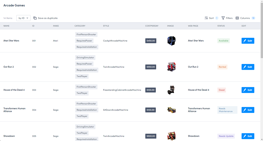
The default arcade-games-list page that was generated for the Arcade Games object contains four elements:
{% extends "base-listview" %}

{% block title %}Arcade Games{% endblock title %}

{% set view_uid="arcade-games-list" %}
{% set resource_name="Arcade Games" %}
The extends component specifes which page the -list page inherits properties from, the block title component provides a title for the page, the set resource_name component defines the name of the resource, and the set validation_schema component defines the validation schema. For information about resources and schemas, see Understand system-generated pages.
The base-listview page contains the Platform listview component. For more information about this component, refer to the Platform ListView documentation in Storybook.
Before overriding any of the default page’s content, the following page is rendered:
This article will take you through the process of overriding the default arcade-games-list page to configure the header, add an Add new record button, and add delete options.
Locate the default page
To locate the default page:
- Click Settings > Developer tools > Platform settings (beta) to display the Platform page.
- Locate the
arcade-games-listpage in the list. Use the filter and sort options if necessary. - Click the page’s Name to open its edit page.
Override the header
The content of the header in the List view page is defined by the header block in the base-listview page:
{% block header %}
  <brz-page-header><span slot="title">{% block title %}{% endblock title %}</span></brz-page-header>
{% endblock header %}
The page title is included in the default page ({% block title %}Arcade Games{% endblock title %}) and uses the object label.
You can override any of the details in this block by adding the {% block header %}{% endblock header %} tags to your page beneath the resource_name element. Enter the components you want to include in your header between these header tags.
Important
You will need to enter all the elements of the header block you want to include even if you only want to override one part. For example, looking at the above code block, even if you only want to change the title, you will still need to add the elements that render the subtitle, icon, and style or they won’t be included on the page.Update the title
The title of the List view page is generated from the {% block title %} element of the default page.
To change the title from Arcade Games to Arcade Game Machines, remove the title block from the top of the page and add the brz-page-header component to your page with the page-title attribute. The title is the value of the attribute.
{% block header %}
<brz-page-header page-title="Arcade Game Machines"></brz-page-header>
{% endblock header %}
Important
Remember to delete theblock title element that was generated by default otherwise the page will not render.
Add a subtitle
To add a subtitle to the header, add the slot="subtitle" attribute to a brz-row component. The text of the subtitle is defined between the span tags.
{% block header %}
<brz-page-header page-title="Arcade Game Machines">
  <brz-row slot="subtitle">
    <span>Stock list</span>
  </brz-row>
</brz-page-header>
{% endblock header %}
Add an icon
To include an icon in the subtitle, add the brz-icon element to the page. To ensure it aligns correctly with the subtitle, it should sit within the brz-row component. In this example, we want to use the details
{% block header %}
<brz-page-header page-title="Arcade Game Machines">
  <brz-row slot="subtitle">
    <brz-icon icon="details"></brz-icon>
      <span>Stock list</span>
  </brz-row>
</brz-page-header>
{% endblock header %}
Add an avatar
To add an avatar to the header and stay consistent with the other pages, add the brz-avatar component below the brz-page-header. As before, use the image-src property and provide a relative or absolute URL to an image file. For best results it should be an exact square of 130px width and height because this component does not resize, crop, or otherwise transform images.
{% block header %}
<brz-page-header page-title="Arcade Game Machines">
<brz-avatar size="large" theme="solid" label="Arcade Machines" image-src="https://cdn.discordapp.com/attachments/790575952487776296/1092737084873256970/arcade_games.jpg" slot="decorator">
  </brz-avatar>
  <brz-row slot="subtitle">
    <brz-icon icon="details"></brz-icon>
      <span>Stock list</span>
  </brz-row>
</brz-page-header>
{% endblock header %}
Add a button to the header
Add an Add new record button to your List view page to give you quick access to the Create record page.
For this example, we are going to add a primary button type which will open Create record page. To add a button, use the <brz-button> element, wrapped in a link to the page you want to open, which in this case is /platform/page/arcade-games-create. For example:
<brz-button slot="actions" element="a" button-type="primary" href="/platform/page/arcade-games-create">Add new record</brz-button>
Added to the header block, it looks as follows:
{% block header %}
<brz-page-header page-title="Arcade Game Machines">
<brz-avatar size="large" theme="solid" label="Arcade Machines" image-src="https://cdn.discordapp.com/attachments/790575952487776296/1092737084873256970/arcade_games.jpg" slot="decorator">
  </brz-avatar>
  <brz-row slot="subtitle">
    <brz-icon icon="details"></brz-icon>
    <span>Stock list</span>
  </brz-row>
  <brz-button slot="actions" element="a" button-type="primary" href="/platform/page/arcade-games-create">Add new record</brz-button>
</brz-page-header>
{% endblock header %}
A list of the available button elements can be found in the Design System documentation.
Add a delete option
Add the ability to select and delete multiple records from your list view page with the bulk_actions component.
Enter the following below the header block to enable you to delete multiple records at once and set a confirmation message.
{% set bulk_actions="[{ \"action\": \"delete\", \"label\": \"Delete\", \"confirmationMessage\": \"Are you sure?\" }]" %}
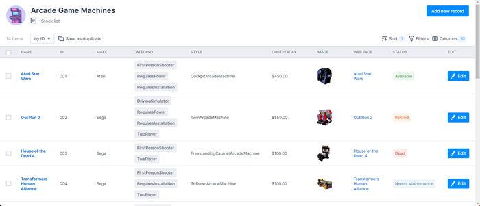
With all these changes, the List view page now renders as:
Completed code
If you’ve gone through all the steps in this article, your completed page template should look as follows:
{% extends "base-listview" %}

{% set view_uid="arcade-games-list" %}
{% set resource_name="Arcade Games" %}

{% block header %}
<brz-page-header page-title="Arcade Game Machines">
<brz-avatar size="large" theme="solid" label="Arcade Machines" image-src="https://cdn.discordapp.com/attachments/790575952487776296/1092737084873256970/arcade_games.jpg" slot="decorator">
  </brz-avatar>
  <brz-row slot="subtitle">
    <brz-icon icon="details"></brz-icon>
      <span>Stock list</span>
  </brz-row>
      <brz-button slot="actions" element="a" button-type="primary" href="/platform/page/arcade-games-create">Add new record</brz-button>
</brz-page-header>
{% endblock header %}

{% set bulk_actions="[{ \"action\": \"delete\", \"label\": \"Delete\", \"confirmationMessage\": \"Are you sure?\" }]" %}
Feedback
Was this page helpful?