Edit the column templates
Once you’ve selected which columns will be displayed in the default list view and the order in which they will appear, you can edit the individual column templates to customize how the data is presented. In order to do this, you first need to open the Edit default columns page.
- Navigate to Settings > Data management > Objects & fields.
- Select the Arcade Games object.
- Click Edit default columns.
Edit column templates
To edit a column template:
- On the Edit default columns page, click the pencil icon
 beside a column name to display the Edit column modal.
 - Use HTML and components from Skedulo’s Breeze UI components in the Column template field to customize how the data is displayed in that column.
- Click Done to close the Edit column modal and view your changes in the Table preview window.
- Click Save to save your changes.
The default Item column
When you create an object, the default list view page displays one column, called Item. The content of this column is generated using the RecordDefiner component and links to an item’s View record page.
If there is a name or Name field associated with your object, then the RecordDefiner component pulls the Item name from there. If there are neither of these fields on your object, the RecordDefiner will pull in the UID.
In the Column template field, this template looks as follows:
<brz-link href="{{_.host.buildPlatformUrl( _.resource.name + '-view?uid=' + _.record.primaryKeyValue )}}">{{_.record.renderDefiner()}}</brz-link>
For the Arcade Games object, we are going leave this template alone because the object has a Name custom field, but we will rename the column from Item to Name.
If you want to link to the View record page from a different column, such as the ID column, add the following to the Column template field:
<brz-link href="{{_.host.buildPlatformUrl( _.resource.name + '-view?uid=' + _.record.primaryKeyValue )}}">{{Id}}</brz-link>
Multi-select picklist column
By default, items in multi-select picklist columns are displayed in one line, for example:
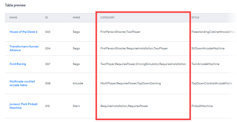
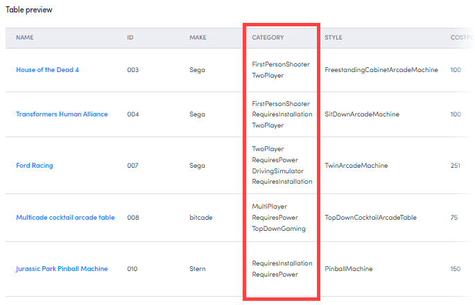
Use the following template to ensure each value sits on a new line:
<ul>{% for item in category %}
<li>{{item}}</li>
{% endfor %}</ul>
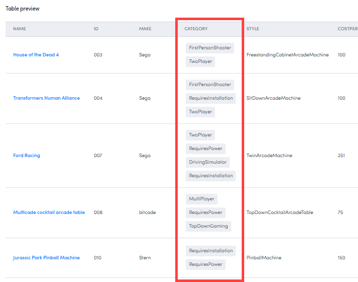
We can further configure this column by wrapping each value in a lozenge using the brz-lozenge component.
<ul>{% for item in category %}
<li><brz-lozenge style="margin: var(--brz-spacing-1)" theme="subtle" color="neutral">{{item}}</brz-lozenge></li>
{% endfor %}</ul>
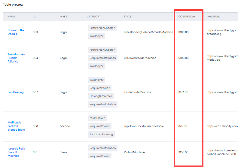
Format the number column
By default, the Cost Per Day column only displays the number entered in the costperday field.
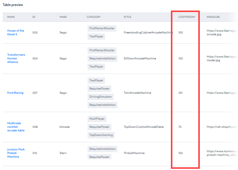
To display this number as currency, enter the following in the Column template field:
${{ costperday |number(decimals=2) }}
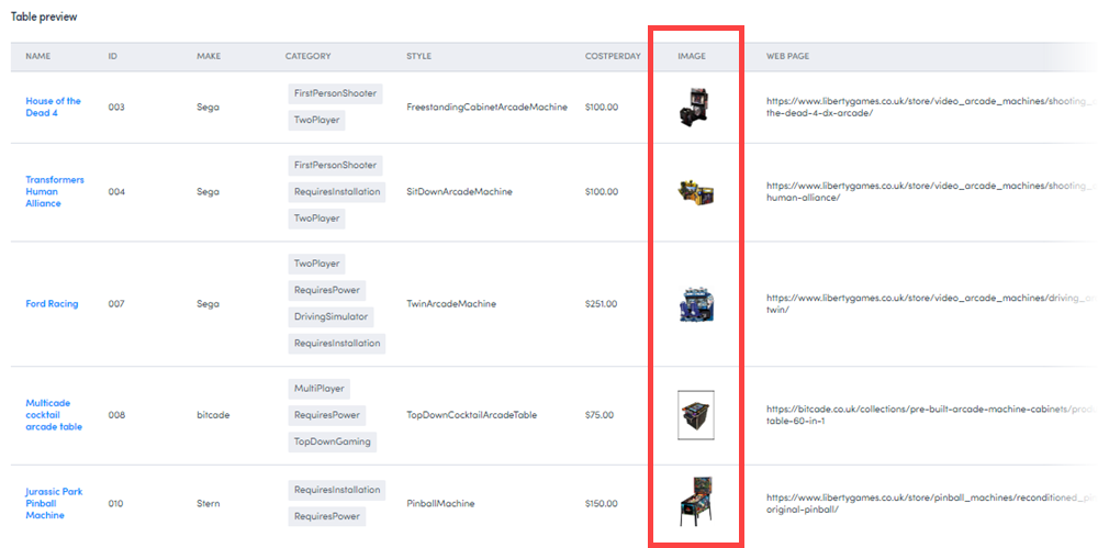
Format the imageurl column
To ensure the url value entered in the imageurl field renders as an image, enter the following in the Column template field:
<img src="{{imageurl}}" width="50" height="50">
In addition, we also want to rename the field. In the Column header field, enter Image.
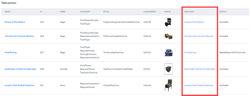
Format the linkurl column
To ensure the url value entered in the linkurl field renders as a hyperlink, use the brz-link component.
<brz-link href="{{ linkurl }}"> {{ name }} </brz-link>
In addition, we also want to rename the field. In the Column header field, enter Web page.
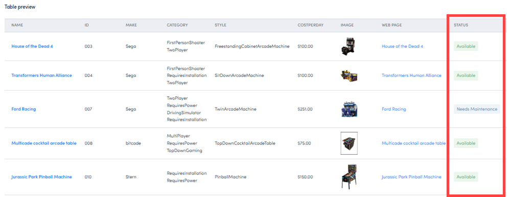
Format the Status column
To have the different status values displayed in colored lozenges, use the brz-lozenge component with conditions:
{% if status == "Available" %}
<brz-lozenge theme="subtle" color="green"> Available </brz-lozenge>

{% elseif status == "NeedsRepairWithCustomer" %}
<brz-lozenge theme ="subtle" color="sapphire"> Needs Maintenance </brz-lozenge>

{% elseif status == "NeedsRepairInStores" %}
<brz-lozenge theme ="subtle" color="sapphire"> Needs Maintenance </brz-lozenge>

{% elseif status == "NeedsSoftwareUpdateWithCustomer" %}
<brz-lozenge theme="subtle" color="purple"> Needs Update </brz-lozenge>

{% elseif status == "NeedsSoftwareUpdateInStores" %}
<brz-lozenge theme="subtle" color="purple"> Needs Update </brz-lozenge>

{% elseif status == "DeadWithCustomer" %}
<brz-lozenge theme="subtle" color="red"> Dead </brz-lozenge>

{% elseif status == "DeadInStores" %}
<brz-lozenge theme="subtle" color="red"> Dead </brz-lozenge>

{% elseif status == "Rented" %}
<brz-lozenge theme="subtle" color="orange"> Rented </brz-lozenge>

{% else %} {{ JobStatus }}

{% endif %}
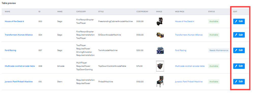
Add a custom column
Finally, we will add a custom column that isn’t related to a custom field. This column will contain an Edit button which links directly to a machine’s edit page.
-
On the Edit default column page, click Add custom column.
-
In the Column header field, enter Edit.
-
In the Column template field, enter:
<brz-button element="a" href="{{_.host.buildPlatformUrl( 'arcade-games-edit?uid=' + _.record.primaryKeyValue )}}" leading-icon="edit" button-type="primary" compact="">Edit</brz-button> -
Click Done.
Feedback
Was this page helpful?