Override the default Create record page
This article covers some of the ways in which you can override the arcade-games-create page that was auto-generated when we created the Arcade Games object. All of the components that you can use to customize your pages can be found in the Design System documentation.
The default page
The default arcade-games-create page that was generated for the Arcade Games object contains three elements:
{% extends "base-recordcreate" %}

{% set resource_name="Arcade Games" %}
{% set validation_schema="ArcadeGamesCreate" %}
The extends component specifes which page the -create page inherits properties from, the set resource_name component defines the name of the resource, and the set validation_schema component defines the validation schema. For information about resources and schemas, see Understand system-generated pages.
On the base-recordcreate page, the content is split into header, body, and footer blocks. To change the content within any of these blocks, you need to add the relevent block tags to your page and then add the components you want to include between them.
Before overriding any of the default page’s content, the following page is rendered in Skedulo Platform:
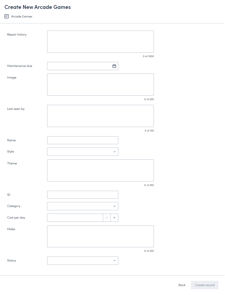
This article will take you through the process of configuring the default arcade-games-create page so that it renders in a more user-friendly way.
Locate the default page
To locate the default page:
- Click Settings > Developer tools > Platform settings (beta) to display the Platform page.
- Locate the
arcade-games-createpage in the list. Use the filter and sort options if necessary. - Click the page’s Name to open its edit page.
Override the header
The content of the header in the Create record page is defined by the header block in the base-recordcreate page:
{% block header %}
  <brz-page-header page-title="Create New {{ resource_name }}">
    <brz-row slot="subtitle">
      <brz-icon icon="details"></brz-icon>
      <span>{{resource_name}}</span>
    </brz-row>
  </brz-page-header>
{% endblock header %}
You can override any of the details in the header by adding the {% block header %}{% endblock header %} tags to your page beneath the validation_schema element, and then rebuilding the header with the components you want to include.
Important
You will need to add all the components that build the header block even if you only want to override one part. For example, looking at the above code block, even if you only want to change the title, you will still need to add the components that render the subtitle and icon or they won’t be included on the page.This section will take you through modifying the title, subtitle, and icon, and then adding an avatar to the header. All the components used, and many more, can be found in the Design System documentation.
Update the title
The title is rendered from the brz-page-header component.
To change the title, add the brz-page-header component to the header block and add your new title, in this case Arcade Game Machines, as the value of the page-title attribute.
{% block header %}
  <brz-page-header page-title="Arcade Game Machines">
  </brz-page-header>
{% endblock header %}
Add a subtitle
To add a subtitle to the header, add slot="subtitle" to a div in the brz-page-header component. In the base page, the subtitle pulls in the resource_name value, but this isn’t very descriptive so we will update it to make it more meaningful:
{% block header %}
  <brz-page-header page-title="Arcade Game Machines">

    <div slot="subtitle">
      Add new machine to stock
    </div>

  </brz-page-header>
{% endblock header %}
Add an icon
To include an icon in the subtitle, add the brz-icon element to the page. The icon included in the base page is the details icon, but you can change it to any of the icons listed in the Design System documentation. In this example, we will use the edit icon.
In order to ensure the icon is aligned correctly with the subtitle, we will need to change where slot="subtitle" sits. Add the brz-row component, then add slot="subtitle" to it.
{% block header %}
  <brz-page-header page-title="Arcade Game Machines">
    <brz-row slot="subtitle">
      <brz-icon icon="edit"></brz-icon>
      <span>Add new machine to stock</span>
    </brz-row>
  </brz-page-header>
{% endblock header %}
Add an avatar
To add an avatar to the header, such as a visual representation of your organization, you can use the brz-avatar component. Use the image-src property and provide a relative or absolute URL to an image file. For best results it should be an exact square of minimum 130px width and height because this component does not transform images.
In this example, we will add an image to represent the fictional Arcade Games organization.
{% block header %}
  <brz-page-header page-title="Arcade Game Machines">
    <brz-avatar size="large" theme="solid" label="Arcade Machines" image-src="https://cdn.discordapp.com/attachments/790575952487776296/1092737084873256970/arcade_games.jpg" slot="decorator">
    </brz-avatar>

    <brz-row slot="subtitle">
      <brz-icon icon="edit"></brz-icon>
      <span>Add new machine to stock</span>
    </brz-row>
  </brz-page-header>
{% endblock header %}
For more information about avatars, refer to the Avatar section in the Design System documentation.
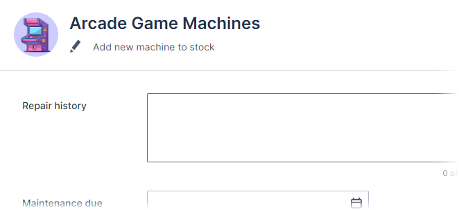
With these few changes, the header of the Create record page now renders as follows:
Override the body
The main body of the Create record page is defined by the body block in the base-recordcreate page:
{% block body %}
  <brz-responsive-columns style="border-top: var(--brz-border-divider);">
    <div>
      <platform-component package-name="recordpage" name="ValidationBanner"></platform-component>
      <platform-component package-name="recordpage" name="AutoForm"></platform-component>
    </div>
  </brz-responsive-columns>
{% endblock body %}
The custom fields that you added to your object are rendered on the Create record page by the AutoForm component. The AutoForm component waits for a validation schema to be parsed and then auto-renders any relevant FormField elements. The ValidationBanner ensures a message banner is displayed if the form doesn’t validate correctly.
To override the appearance of the content in the body of the Create record page, add the {% block body %} and {% endblock body %} tags to your page beneath the header block and then add the components between them.
Important
You will need to add all the elements of the body block you want to include even if you only want to override one element. For example, you must add all fields to the page even if you only want to edit one.Reorder the fields
Autoform renders the fields in the sequence in which they appear on the validation schema. To reorder the fields, you can override this by adding the individual AutoFormField components in the order you want them to appear between the {% block body %} and {% endblock body %} tags.
For each AutoFormField component line, you can configure the following:
ptr– This is the field’s name. Ensure that this value matches the case you used for the Field name value on the Create Custom Field modal or the field will not render on your page.label-postion– This can betoporsideand defines where the field label is displayed. In this example, we will usetop.placeholder– This is the text displayed in the field to provide extra context about the action required.
Note: Remember to add the ValidationBanner component to ensure a message is displayed if the form doesn’t validate correctly.
{% block body %}
      <platform-component package-name="recordpage" name="ValidationBanner"></platform-component>
      <platform-component package-name="recordpage" name="AutoFormField" ptr="/name" label-position="top" placeholder="Enter a name"></platform-component>
      <platform-component package-name="recordpage" name="AutoFormField" ptr="/Id" label-position="top" placeholder="Enter a product ID"></platform-component>
      <platform-component package-name="recordpage" name="AutoFormField" ptr="/style" label-position="top" placeholder="Select a style"></platform-component>
      <platform-component package-name="recordpage" name="AutoFormField" ptr="/category" label-position="top" placeholder="Select a category"></platform-component>
      <platform-component package-name="recordpage" name="AutoFormField" ptr="/make" label-position="top" placeholder="Enter a make"></platform-component>
      <platform-component package-name="recordpage" name="AutoFormField" ptr="/theme" label-position="top" placeholder="Enter a theme"></platform-component>
      <platform-component package-name="recordpage" name="AutoFormField" ptr="/costperday" label-position="top" placeholder="Enter a cost"></platform-component>
      <platform-component package-name="recordpage" name="AutoFormField" ptr="/linkurl" label-position="top" placeholder="Enter a url"></platform-component>
      <platform-component package-name="recordpage" name="AutoFormField" ptr="/imageurl" label-position="top" placeholder="Enter an image url"></platform-component>
      <platform-component package-name="recordpage" name="AutoFormField" ptr="/maintenancedue" label-position="top" placeholder="Date annual maintenance is due"></platform-component>
      <platform-component package-name="recordpage" name="AutoFormField" ptr="/repairhistory" label-position="top" placeholder="Enter pertinant repair history and engineer notes"></platform-component>
      <platform-component package-name="recordpage" name="AutoFormField" ptr="/lastseenby" label-position="top" placeholder="Who was the last engineer to see the machine?"></platform-component>
      <platform-component package-name="recordpage" name="AutoFormField" ptr="/status" label-position="top" placeholder="Maintenance status"></platform-component>
{% endblock body %}
Split the page into columns
We’ve added the fields in the order we want them to appear, but they are currently displayed in one column which is aligned to the edge of the page.
There are a number of ways to divide up the layout of your record page, and they are all covered in the Breeze Layout section of the Design System documentation. In this example, we will use <brz-responsive-columns> to split the content into two columns.
Wrap the brz-responsive-columns component around the content of your body block, then use div elements to split the content:
{% block body %}
  <platform-component package-name="recordpage" name="ValidationBanner"></platform-component>
  <brz-responsive-columns>
      <div>
        <platform-component package-name="recordpage" name="AutoFormField" ptr="/name" label-position="top" ></platform-component>
        <platform-component package-name="recordpage" name="AutoFormField" ptr="/id" label-position="top" placeholder="Enter a product ID"></platform-component>
        <platform-component package-name="recordpage" name="AutoFormField" ptr="/style" label-position="top" placeholder="Select a style"></platform-component>
        <platform-component package-name="recordpage" name="AutoFormField" ptr="/category" label-position="top" placeholder="Select a category"></platform-component>
        <platform-component package-name="recordpage" name="AutoFormField" ptr="/make" label-position="top" placeholder="Enter a make"></platform-component>
        <platform-component package-name="recordpage" name="AutoFormField" ptr="/theme" label-position="top" placeholder="Enter a theme"></platform-component>
        <platform-component package-name="recordpage" name="AutoFormField" ptr="/costperday" label-position="top" placeholder="Enter a cost"></platform-component>
        <platform-component package-name="recordpage" name="AutoFormField" ptr="/linkurl" label-position="top" placeholder="Enter a url"></platform-component>
      </div>
      <div>
        <platform-component package-name="recordpage" name="AutoFormField" ptr="/imageurl" label-position="top" placeholder="Enter an image url"></platform-component>
        <platform-component package-name="recordpage" name="AutoFormField" ptr="/maintenancedue" label-position="top" placeholder="Date annual maintenance is due"></platform-component>
        <platform-component package-name="recordpage" name="AutoFormField" ptr="/repairhistory" label-position="top" placeholder="Enter pertinant repair history and engineer notes"></platform-component>
        <platform-component package-name="recordpage" name="AutoFormField" ptr="/lastseenby" label-position="top" placeholder="Who was the last engineer to see the machine?"></platform-component>
        <platform-component package-name="recordpage" name="AutoFormField" ptr="/status" label-position="top" placeholder="Maintenance status"></platform-component>
      </div>
  </brz-responsive-columns>
{% endblock body %}
Add headings to the body
Add headings to group the fields into sections. To add headings to the body block, use the brz-heading element. In this example, we are going to add three headings: Summary, Machine image, and Maintenance details.
{% block body %}
  <platform-component package-name="recordpage" name="ValidationBanner"></platform-component>
  <brz-responsive-columns>
      <div>
        <brz-heading size="base" style="margin-bottom: var(--brz-spacing-4)">Summary</brz-heading>
          <platform-component package-name="recordpage" name="AutoFormField" ptr="/name" label-position="top" ></platform-component>
          <platform-component package-name="recordpage" name="AutoFormField" ptr="/id" label-position="top" placeholder="Enter a product ID"></platform-component>
          <platform-component package-name="recordpage" name="AutoFormField" ptr="/style" label-position="top" placeholder="Select a style"></platform-component>
          <platform-component package-name="recordpage" name="AutoFormField" ptr="/category" label-position="top" placeholder="Select a category"></platform-component>
          <platform-component package-name="recordpage" name="AutoFormField" ptr="/make" label-position="top" placeholder="Enter a make"></platform-component>
          <platform-component package-name="recordpage" name="AutoFormField" ptr="/theme" label-position="top" placeholder="Enter a theme"></platform-component>
          <platform-component package-name="recordpage" name="AutoFormField" ptr="/costperday" label-position="top" placeholder="Enter a cost"></platform-component>
          <platform-component package-name="recordpage" name="AutoFormField" ptr="/linkurl" label-position="top" placeholder="Enter a url"></platform-component>
      </div>
      <div>
        <brz-heading size="base" style="margin-bottom: var(--brz-spacing-4)">Machine image</brz-heading>
        <platform-component package-name="recordpage" name="AutoFormField" ptr="/imageurl" label-position="top" placeholder="Enter an image url"></platform-component>

        <brz-heading size="base" style="margin-bottom: var(--brz-spacing-4)">Maintenance details</brz-heading>
        <platform-component package-name="recordpage" name="AutoFormField" ptr="/maintenancedue" label-position="top" placeholder="Date annual maintenance is due"></platform-component>
        <platform-component package-name="recordpage" name="AutoFormField" ptr="/repairhistory" label-position="top" placeholder="Enter pertinant repair history and engineer notes"></platform-component>
        <platform-component package-name="recordpage" name="AutoFormField" ptr="/lastseenby" label-position="top" placeholder="Who was the last engineer to see the machine?"></platform-component>
        <platform-component package-name="recordpage" name="AutoFormField" ptr="/status" label-position="top" placeholder="Maintenance status"></platform-component>
      </div>
  </brz-responsive-columns>
{% endblock body %}
Add a border
To add a border between the header and body sections of your page, add style="border-top: var(--brz-border-divider)" to the brz-responsive columns component. For example:
{% block body %}
  <platform-component package-name="recordpage" name="ValidationBanner"></platform-component>
  <brz-responsive-columns style="border-top: var(--brz-border-divider)">
      <div>
        <brz-heading size="base" style="margin-bottom: var(--brz-spacing-4)">Summary</brz-heading>
          <platform-component package-name="recordpage" name="AutoFormField" ptr="/name" label-position="top" ></platform-component>
          <platform-component package-name="recordpage" name="AutoFormField" ptr="/id" label-position="top" placeholder="Enter a product ID"></platform-component>
          <platform-component package-name="recordpage" name="AutoFormField" ptr="/style" label-position="top" placeholder="Select a style"></platform-component>
          <platform-component package-name="recordpage" name="AutoFormField" ptr="/category" label-position="top" placeholder="Select a category"></platform-component>
          <platform-component package-name="recordpage" name="AutoFormField" ptr="/make" label-position="top" placeholder="Enter a make"></platform-component>
          <platform-component package-name="recordpage" name="AutoFormField" ptr="/theme" label-position="top" placeholder="Enter a theme"></platform-component>
          <platform-component package-name="recordpage" name="AutoFormField" ptr="/costperday" label-position="top" placeholder="Enter a cost"></platform-component>
          <platform-component package-name="recordpage" name="AutoFormField" ptr="/linkurl" label-position="top" placeholder="Enter a url"></platform-component>
      </div>
      <div>
        <brz-heading size="base" style="margin-bottom: var(--brz-spacing-4)">Machine image</brz-heading>
        <platform-component package-name="recordpage" name="AutoFormField" ptr="/imageurl" label-position="top" placeholder="Enter an image url"></platform-component>

        <brz-heading size="base" style="margin-bottom: var(--brz-spacing-4)">Maintenance details</brz-heading>
        <platform-component package-name="recordpage" name="AutoFormField" ptr="/maintenancedue" label-position="top" placeholder="Date annual maintenance is due"></platform-component>
        <platform-component package-name="recordpage" name="AutoFormField" ptr="/repairhistory" label-position="top" placeholder="Enter pertinant repair history and engineer notes"></platform-component>
        <platform-component package-name="recordpage" name="AutoFormField" ptr="/lastseenby" label-position="top" placeholder="Who was the last engineer to see the machine?"></platform-component>
        <platform-component package-name="recordpage" name="AutoFormField" ptr="/status" label-position="top" placeholder="Maintenance status"></platform-component>
      </div>
  </brz-responsive-columns>
{% endblock body %}
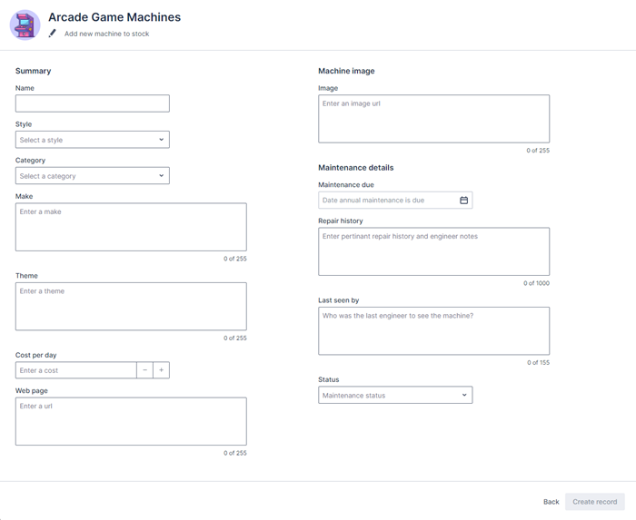
The Create record page now renders as follows:
Override the footer
The footer of the Create record page is defined by the footer block in the base page:
{% block footer %}
  <brz-button-group slot="right">
    <a href="{{ back_url }}"><brz-button button-type="transparent">Back</brz-button></a>
    <platform-component package-name="recordpage" name="SaveButton" body="Create record"></platform-component>
  </brz-button-group>
{% endblock footer %}
In order to override the default content of the footer, add the {% block footer %} and {% endblock footer %} tags to the bottom of your page.
Edit the text on the footer button
To override the text on the button in the Create record page footer, enter the following information between the {% block footer %} and {% endblock footer %} tags, where the value of body= is the text that appears on the button:
{% block footer %}
  <brz-button-group slot="right">
    <a href="{{ back_url }}"><brz-button button-type="transparent">Back</brz-button></a>
    <platform-component package-name="recordpage" name="SaveButton" body="Create machine record"></platform-component>
  </brz-button-group>
{% endblock footer %}
For more information on the ways you can configure buttons on your pages, see the Button section in the Design System documentation.
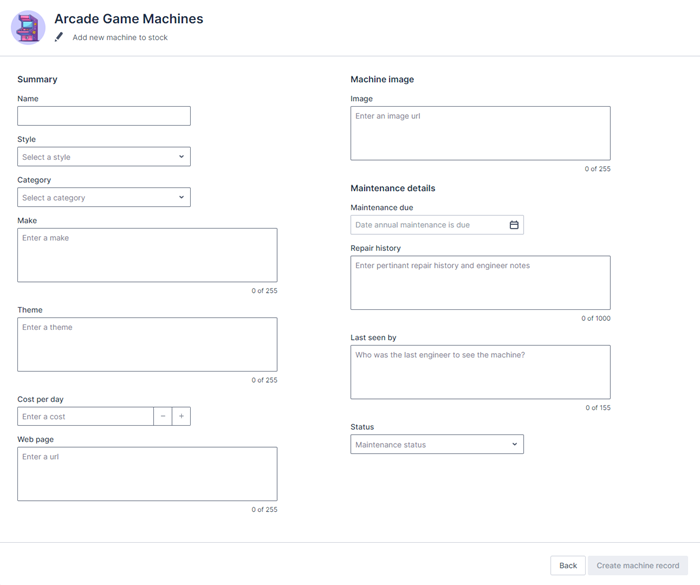
With all these changes, the Create record page now renders as:
Completed code
If you’ve gone through all the steps in this article, your completed page template should now look as follows:
{% extends "base-recordcreate" %}

{% set resource_name="Arcade Games" %}
{% set validation_schema="ArcadeGamesCreate" %}

{% block header %}
  <brz-page-header page-title="Arcade Game Machines">
    <brz-avatar size="large" theme="solid" label="Arcade Machines" image-src="https://cdn.discordapp.com/attachments/790575952487776296/1092737084873256970/arcade_games.jpg" slot="decorator">
  </brz-avatar>
    <brz-row slot="subtitle">
      <brz-icon icon="edit"></brz-icon>
      <span>Add new machine to stock</span>
    </brz-row>
  </brz-page-header>
{% endblock header %}

{% block body %}
  <platform-component package-name="recordpage" name="ValidationBanner"></platform-component>
  <brz-responsive-columns style="border-top: var(--brz-border-divider)">
      <div>
        <brz-heading size="base" style="margin-bottom: var(--brz-spacing-4)">Summary</brz-heading>
          <platform-component package-name="recordpage" name="AutoFormField" ptr="/name" label-position="top" ></platform-component>
          <platform-component package-name="recordpage" name="AutoFormField" ptr="/id" label-position="top" placeholder="Enter a product ID"></platform-component>
          <platform-component package-name="recordpage" name="AutoFormField" ptr="/style" label-position="top" placeholder="Select a style"></platform-component>
          <platform-component package-name="recordpage" name="AutoFormField" ptr="/category" label-position="top" placeholder="Select a category"></platform-component>
          <platform-component package-name="recordpage" name="AutoFormField" ptr="/make" label-position="top" placeholder="Enter a make"></platform-component>
          <platform-component package-name="recordpage" name="AutoFormField" ptr="/theme" label-position="top" placeholder="Enter a theme"></platform-component>
          <platform-component package-name="recordpage" name="AutoFormField" ptr="/costperday" label-position="top" placeholder="Enter a cost"></platform-component>
          <platform-component package-name="recordpage" name="AutoFormField" ptr="/linkurl" label-position="top" placeholder="Enter a url"></platform-component>
      </div>
      <div>
        <brz-heading size="base" style="margin-bottom: var(--brz-spacing-4)">Machine image</brz-heading>
        <platform-component package-name="recordpage" name="AutoFormField" ptr="/imageurl" label-position="top" placeholder="Enter an image url"></platform-component>

        <brz-heading size="base" style="margin-bottom: var(--brz-spacing-4)">Maintenance details</brz-heading>
        <platform-component package-name="recordpage" name="AutoFormField" ptr="/maintenancedue" label-position="top" placeholder="Date annual maintenance is due"></platform-component>
        <platform-component package-name="recordpage" name="AutoFormField" ptr="/repairhistory" label-position="top" placeholder="Enter pertinant repair history and engineer notes"></platform-component>
        <platform-component package-name="recordpage" name="AutoFormField" ptr="/lastseenby" label-position="top" placeholder="Who was the last engineer to see the machine?"></platform-component>
        <platform-component package-name="recordpage" name="AutoFormField" ptr="/status" label-position="top" placeholder="Maintenance status"></platform-component>
      </div>
  </brz-responsive-columns>
{% endblock body %}

{% block footer %}
  <brz-button-group slot="right">
    <a href="{{ back_url }}"><brz-button button-type="transparent">Back</brz-button></a>
    <platform-component package-name="recordpage" name="SaveButton" body="Create machine record"></platform-component>
  </brz-button-group>
{% endblock footer %}
Feedback
Was this page helpful?