Override the default Edit record page
This article covers some of the ways in which you can override the arcade-games-edit page that was auto-generated when we created the Arcade Games object. All of the components you can use to customize your pages can be found in the Design System documentation.
The default page
The default arcade-games-edit page that was generated for the Arcade Games object contains three elements:
{% extends "base-recordedit" %}

{% set resource_name="Arcade Games" %}
{% set validation_schema="ArcadeGamesEdit" %}
The extends component specifes which page the -edit page inherits properties from, the set resource_name component defines the name of the resource, and the set validation_schema component defines the validation schema. For information about resources and schemas, see Understand system-generated pages.
On the base-recordedit page, the content is split into header, body, and footer blocks. To change the content within any of these blocks, you need to add the relevant block tags to your page and then add components you want to include between them.
Before overriding any of the default page’s content, the following page is rendered in Skedulo Platform:

This article will take you through the process of configuring the default arcade-games-edit page so that it renders in a more user-friendly way and matches the layout of the Arcade Games Create record page, for example:

Locate the default page
To locate the default page:
- Click Settings > Developer tools > Platform settings (beta) to display the Platform page.
- Find the
arcade-games-editpage in the list. Use the filter and sort options if necessary. - Click the page’s Name to open its edit page.
Override the header
The content of the header in the Edit record page is defined by the header block in the base-recordedit page.
{% block header %}
    <brz-page-header>
      <brz-row slot="title">
        <brz-heading size="2xl" level="1">
          {% block title %}
            <platform-component package-name="recordpage" name="RecordDefiner"></platform-component>
          {% endblock title %}
        </brz-heading>
      </brz-row>
      <brz-row slot="subtitle">
        <brz-icon icon="details"></brz-icon>
        <span>{{resource_name}}</span>
      </brz-row>
    </brz-page-header>
{% endblock header %}
You can override any of the details in the header by adding the {% block header %}{% endblock header %} tags to your page beneath the validation_schema element, and then rebuilding the header with the components you want to include. 11
Important
You will need to enter all the elements of the header block you want to include even if you only want to override one part. For example, looking at the above code block, even if you only want to change the title, you will still need to add the elements that render the subtitle, icon, and style or they won’t be included on the page.Add the title
The title of the Edit record page is generated from the RecordDefiner component that is located between the title tags. If there is a name or Name field associated with your object, then the RecordDefiner component pulls the page title from there. If there are neither of these fields on your object, the RecordDefiner will pull in the UID.
In this example, we don’t want to change the title because the Arcade Games object has a Name field for the RecordDefiner component to reference, but as we are making other changes to the header, we’ll still need to add the component to the arcade-games-edit page.
{% block header %}
    <brz-page-header>
      <brz-row slot="title">
        <brz-heading size="2xl" level="1">
          {% block title %}
            <platform-component package-name="recordpage" name="RecordDefiner"></platform-component>
          {% endblock title %}
        </brz-heading>
      </brz-row>
      <brz-row slot="subtitle">
        <brz-icon icon="details"></brz-icon>
        <span>{{resource_name}}</span>
      </brz-row>
    </brz-page-header>
{% endblock header %}
Update the subtitle and icon
The content of the subtitle is specified between the span tags in the second brz-row component. We’ve copied the header block from the base page, so we just need to change the text between the span tags from {{resource-name}} to Edit the machine's details.
The icon included in the base page is the details icon, and we will to change this to the edit icon.
{% block header %}
    <brz-page-header>
      <brz-row slot="title">
        <brz-heading size="2xl" level="1">
          {% block title %}
            <platform-component package-name="recordpage" name="RecordDefiner"></platform-component>
          {% endblock title %}
        </brz-heading>
      </brz-row>
      <brz-row slot="subtitle">
        <brz-icon icon="edit"></brz-icon>
        <span>Edit the machine's details</span>
      </brz-row>
    </brz-page-header>
{% endblock header %}
Add an avatar
To add an avatar to the header and stay consistent with the Create record and View record pages, add the brz-avatar component below the brz-page-header. As before, use the image-src property and provide a relative or absolute URL to an image file. For best results it should be an exact square of 130px width and height because this component does not resize, crop, or otherwise transform images.
{% block header %}
    <brz-page-header>
      <brz-avatar size="large" theme="solid" label="Arcade Machines" image-src="https://cdn.discordapp.com/attachments/790575952487776296/1092737084873256970/arcade_games.jpg" slot="decorator">
      </brz-avatar>
      <brz-row slot="title">
        <brz-heading size="2xl" level="1">
          {% block title %}
            <platform-component package-name="recordpage" name="RecordDefiner"></platform-component>
          {% endblock title %}
        </brz-heading>
      </brz-row>
      <brz-row slot="subtitle">
        <brz-icon icon="edit"></brz-icon>
        <span>Edit the machine's details</span>
      </brz-row>
    </brz-page-header>
{% endblock header %}
Override the body
The main body of the Edit record page is defined by the body block in the base-recordedit page.
{% block body %}
<brz-tabs>
  <brz-tab slot="tabs" name="details">Details</brz-tab>
  <brz-tab slot="tabs" name="system-info">System Info</brz-tab>

  <brz-tab-panel name="details">
    <brz-responsive-columns>
      <div>
        <platform-component package-name="recordpage" name="ValidationBanner"></platform-component>
        <platform-component package-name="recordpage" name="AutoForm"></platform-component>
      </div>
    </brz-responsive-columns>
  </brz-tab-panel>
  <brz-tab-panel name="system-info">
    <brz-responsive-columns>
      <div>
        <platform-component package-name="recordpage" name="RecordFields" only-system-fields></platform-component>
      </div>
    </brz-responsive-columns>
  </brz-tab-panel>
</brz-tabs>
{% endblock body %}
To override the appearance of the content in the body of the Edit Record page, add the {% block body %} and {% endblock body %} tags to your arcade-games-edit page and then add the components between them.
Important
You will need to add all the elements of the body block you want to include even if you only want to override one element. For example, you must add all fields to the page even if you only want to edit one.Configure the layout
To ensure consistancy between the Create record and Edit record pages, the first thing we will do is recreate the changes we made to the arcade-games-create page: reorder the fields, add the headings, and divide the page into two columns.
In order to do this, add the following to the arcade-games-edit page:
{% block body %}
  <brz-responsive-columns>
      <div>
          <brz-heading size="base" style="margin-bottom: var(--brz-spacing-4)">Machine details</brz-heading>
            <platform-component package-name="recordpage" name="AutoFormField" ptr="/name" label-position="top" ></platform-component>
            <platform-component package-name="recordpage" name="AutoFormField" ptr="/Id" label-position="top" placeholder="Enter a product ID"></platform-component>
            <platform-component package-name="recordpage" name="AutoFormField" ptr="/style" label-position="top" placeholder="Select a style"></platform-component>
            <platform-component package-name="recordpage" name="AutoFormField" ptr="/category" label-position="top" placeholder="Select a category"></platform-component>
            <platform-component package-name="recordpage" name="AutoFormField" ptr="/make" label-position="top" placeholder="Enter a make"></platform-component>
            <platform-component package-name="recordpage" name="AutoFormField" ptr="/theme" label-position="top" placeholder="Enter a theme"></platform-component>
            <platform-component package-name="recordpage" name="AutoFormField" ptr="/costperday" label-position="top" placeholder="Enter a cost per day"></platform-component>
            <platform-component package-name="recordpage" name="AutoFormField" ptr="/linkurl" label-position="top" placeholder="Enter a cost per day"></platform-component>
      </div>
      <div>
          <brz-heading size="base" style="margin-bottom: var(--brz-spacing-4)">Machine image</brz-heading>
            <platform-component package-name="recordpage" name="RecordTemplate" template="{{ '<img src="{{imageurl}}" alt="{{Name}}" width="200" height="200">' }}"></platform-component>
            <platform-component package-name="recordpage" name="AutoFormField" ptr="/imageurl" label-position="top" placeholder="Enter an image url"></platform-component>

          <brz-heading size="base" style="margin-bottom: var(--brz-spacing-4)">Maintenance record</brz-heading>
            <platform-component package-name="recordpage" name="AutoFormField" ptr="/maintenancedue" label-position="top" placeholder="Date annual maintenance is due"></platform-component>
            <platform-component package-name="recordpage" name="AutoFormField" ptr="/repairhistory" label-position="top" placeholder="Enter pertinant repair history and engineer notes"></platform-component>
            <platform-component package-name="recordpage" name="AutoFormField" ptr="/lastseenby" label-position="top" placeholder="Who was the last engineer to see the machine?"></platform-component>
            <platform-component package-name="recordpage" name="AutoFormField" ptr="/status" label-position="top" placeholder="Maintenance status"></platform-component>
      </div>
  </brz-responsive-columns>
{% endblock body %}
Important
You must ensure that theptr= value matches the case you used for the Field name value on the Create Custom Field modal or the field will not render on your page.
Add tabs
The default Edit record page is divided into two tabs in order to separate the editable content and the un-editable system information. When we overrode the body block in order to configure the layout of the fields, the tabbed layout of the default page was lost. To recreate the tabbed layout, add:
- the
brz-tabselement to add tabs to the page. - the
brz-tabelement to identify the tabs. - the
brz-tab-panelelement to group the content of a tab.
The system information is rendered from the recordpage component, <platform-component package-name="recordpage" name="RecordFields" only-system-fields></platform-component> which we will add to the second tab.
In the page, this will look as follows:
{% block body %}
  <brz-tabs>
      <brz-tab slot="tabs" name="details">Machine Details</brz-tab>
      <brz-tab slot="tabs" name="system-info">System Information</brz-tab>

  <brz-tab-panel name="details" shown>
      <brz-responsive-columns style="border-top: var(--brz-border-divider)">
        <div>
          <brz-heading size="base" style="margin-bottom: var(--brz-spacing-4)">Machine details</brz-heading>
              <platform-component package-name="recordpage" name="AutoFormField" ptr="/name" label-position="top" ></platform-component>
              <platform-component package-name="recordpage" name="AutoFormField" ptr="/Id" label-position="top" placeholder="Enter a product ID"></platform-component>
              <platform-component package-name="recordpage" name="AutoFormField" ptr="/style" label-position="top" placeholder="Select a style"></platform-component>
              <platform-component package-name="recordpage" name="AutoFormField" ptr="/category" label-position="top" placeholder="Select a category"></platform-component>
              <platform-component package-name="recordpage" name="AutoFormField" ptr="/make" label-position="top" placeholder="Enter a make"></platform-component>
              <platform-component package-name="recordpage" name="AutoFormField" ptr="/theme" label-position="top" placeholder="Enter a theme"></platform-component>
              <platform-component package-name="recordpage" name="AutoFormField" ptr="/costperday" label-position="top" placeholder="Enter a cost per day"></platform-component>
              <platform-component package-name="recordpage" name="AutoFormField" ptr="/linkurl" label-position="top" placeholder="Enter a cost per day"></platform-component>
        </div>
        <div>
          <brz-heading size="base" style="margin-bottom: var(--brz-spacing-4)">Machine image</brz-heading>
              <platform-component package-name="recordpage" name="RecordTemplate" template="{{ '<img src="{{imageurl}}" alt="{{Name}}" width="200" height="200">' }}"></platform-component>
              <platform-component package-name="recordpage" name="AutoFormField" ptr="/imageurl" label-position="top" placeholder="Enter an image url"></platform-component>

          <brz-heading size="base" style="margin-bottom: var(--brz-spacing-4)">Maintenance record</brz-heading>
              <platform-component package-name="recordpage" name="AutoFormField" ptr="/maintenancedue" label-position="top" placeholder="Date annual maintenance is due"></platform-component>
              <platform-component package-name="recordpage" name="AutoFormField" ptr="/repairhistory" label-position="top" placeholder="Enter pertinant repair history and engineer notes"></platform-component>
              <platform-component package-name="recordpage" name="AutoFormField" ptr="/lastseenby" label-position="top" placeholder="Who was the last engineer to see the machine?"></platform-component>
              <platform-component package-name="recordpage" name="AutoFormField" ptr="/status" label-position="top" placeholder="Maintenance status"></platform-component>
        </div>
      </brz-responsive-columns>
  </brz-tab-panel>

  <brz-tab-panel name="system-info">
      <brz-responsive-columns>
        <div style="margin-top: var(--brz-spacing-4);padding: 0 var(--brz-spacing-6);">
            <platform-component package-name="recordpage" name="RecordFields" only-system-fields></platform-component>
        </div>
      </brz-responsive-columns>
  </brz-tab-panel>

  </brz-tabs>
{% endblock body %}
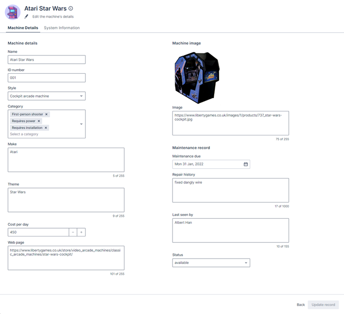
With all these changes, the Edit record page now renders as:
Completed code
If you’ve gone through all the steps in this article, your completed page template should look as follows:
{% extends "base-recordedit" %}

{% set resource_name="Arcade Games" %}
{% set validation_schema="ArcadeGamesEdit" %}

{% block header %}
    <brz-page-header>
      <brz-avatar size="large" theme="solid" label="Arcade Machines" image-src="https://cdn.discordapp.com/attachments/790575952487776296/1092737084873256970/arcade_games.jpg" slot="decorator">
      </brz-avatar>
      <brz-row slot="title">
        <brz-heading size="2xl" level="1">
          {% block title %}
            <platform-component package-name="recordpage" name="RecordDefiner"></platform-component>
          {% endblock title %}
        </brz-heading>
      </brz-row>
      <brz-row slot="subtitle">
        <brz-icon icon="edit"></brz-icon>
        <span>Edit the machine's details</span>
      </brz-row>
    </brz-page-header>
{% endblock header %}

{% block body %}
  <brz-tabs>
      <brz-tab slot="tabs" name="details">Machine Details</brz-tab>
      <brz-tab slot="tabs" name="system-info">System Information</brz-tab>

  <brz-tab-panel name="details" shown>
      <brz-responsive-columns style="border-top: var(--brz-border-divider)">
        <div>
          <brz-heading size="base" style="margin-bottom: var(--brz-spacing-4)">Machine details</brz-heading>
              <platform-component package-name="recordpage" name="AutoFormField" ptr="/name" label-position="top" ></platform-component>
              <platform-component package-name="recordpage" name="AutoFormField" ptr="/Id" label-position="top" placeholder="Enter a product ID"></platform-component>
              <platform-component package-name="recordpage" name="AutoFormField" ptr="/style" label-position="top" placeholder="Select a style"></platform-component>
              <platform-component package-name="recordpage" name="AutoFormField" ptr="/category" label-position="top" placeholder="Select a category"></platform-component>
              <platform-component package-name="recordpage" name="AutoFormField" ptr="/make" label-position="top" placeholder="Enter a make"></platform-component>
              <platform-component package-name="recordpage" name="AutoFormField" ptr="/theme" label-position="top" placeholder="Enter a theme"></platform-component>
              <platform-component package-name="recordpage" name="AutoFormField" ptr="/costperday" label-position="top" placeholder="Enter a cost per day"></platform-component>
              <platform-component package-name="recordpage" name="AutoFormField" ptr="/linkurl" label-position="top" placeholder="Enter a cost per day"></platform-component>
        </div>
        <div>
          <brz-heading size="base" style="margin-bottom: var(--brz-spacing-4)">Machine image</brz-heading>
              <platform-component package-name="recordpage" name="RecordTemplate" template="{{ '<img src="{{imageurl}}" alt="{{Name}}" width="200" height="200">' }}"></platform-component>
              <platform-component package-name="recordpage" name="AutoFormField" ptr="/imageurl" label-position="top" placeholder="Enter an image url"></platform-component>

          <brz-heading size="base" style="margin-bottom: var(--brz-spacing-4)">Maintenance record</brz-heading>
              <platform-component package-name="recordpage" name="AutoFormField" ptr="/maintenancedue" label-position="top" placeholder="Date annual maintenance is due"></platform-component>
              <platform-component package-name="recordpage" name="AutoFormField" ptr="/repairhistory" label-position="top" placeholder="Enter pertinant repair history and engineer notes"></platform-component>
              <platform-component package-name="recordpage" name="AutoFormField" ptr="/lastseenby" label-position="top" placeholder="Who was the last engineer to see the machine?"></platform-component>
              <platform-component package-name="recordpage" name="AutoFormField" ptr="/status" label-position="top" placeholder="Maintenance status"></platform-component>
        </div>
      </brz-responsive-columns>
  </brz-tab-panel>

  <brz-tab-panel name="system-info">
      <brz-responsive-columns>
        <div style="margin-top: var(--brz-spacing-4);padding: 0 var(--brz-spacing-6);">
            <platform-component package-name="recordpage" name="RecordFields" only-system-fields></platform-component>
        </div>
      </brz-responsive-columns>
  </brz-tab-panel>

  </brz-tabs>
{% endblock body %}
Feedback
Was this page helpful?