Select editor
Description
The selectEditor component allows users to select an item from a set of data, such as a list of products, items, or services.
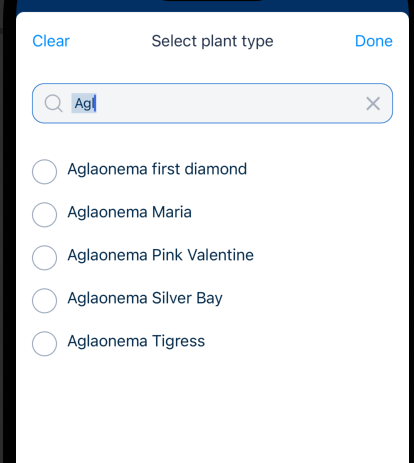
The data can be sourced from a local or online data source. Items in the set are either displayed as a list of items to be selected or as a searchable list of items.
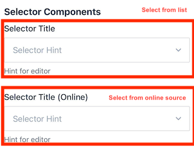
Note that the selectEditor component is for users to select a single item. If you would like the ability for multiple items to be selected, consider using the multi-select component.
Note
You can download our example forms, including the UI Components Showcase from the Skedulo Plus Examples repository.Properties
The following table describes the properties that are used to configure the selectorEditor page component.
| Property | Description |
|---|---|
showIfExpression |
When the showIfExpression property is defined, it adjusts the component visibility based on the boolean value returned by the expression. |
structureExpression |
When a user selects an item’s data object, it is cloned and bound to the structureExpression. For example, if the form defines "structureExpression": "pageData.Product", the form can use the data of the Product in other parts of the extension. For example, it can show the selected item’s name by "pageData.Product.Name". |
valueExpression |
Defines the data context binding expression. The UID of the selected item is bound to this expression. Therefore, when the user selects an item, the item’s UID is bound to the pageData.ProductId. |
sourceExpression |
The data expression that returns the list of items to be selected. |
onlineSource |
The online source that is used to retrieve the data. This data is read-only from online mode. |
displayExpression |
Indicates which property’s value is shown. For example, if the displayExpression is "pageData.Product.Name", the value of field Name of the "pageData.Product" is displayed in the UI of the editor after the user has selected the item. |
caption |
A localized expression string providing additional information about the selected item in the editor. |
placeholder |
The placeholder text that is a hint or description shown inside the text field before the user enters a value. = |
selectPage |
Specifies the page displaying the list of selectable items. |
selectPage.itemTitle |
A localized expression defining how to render the title of each selected item. |
selectPage.itemCaption |
A localized expression defining how to render the caption of each selected item. |
selectPage.emptyText |
A localized expression defining the text displayed when there are no items to select. |
selectPage.title |
A localized expression defining the title of the select page. |
selectPage.hasSection |
Groups items by corresponding sections, similar to the list page hasSection component. |
selectPage.orderBy |
An array defining the properties used to sort the order of items in the list, similar to the list page orderBy component. |
searchBar |
Enables the search bar on the selected page. If not defined, the search bar won’t be shown. |
searchBar.placeholder |
A localized expression defining the placeholder text displayed in the search bar. |
searchBar.filterOnProperties |
An array defining the properties used to filter items in the list. |
filterExpression |
The data expression returning a boolean value. Refer to this section. |
Property usage
structureExpression and valueExpression
In contrast to most editor components, the control data for this component involves two parts:
-
Normalization: Typically, other editor controls require only this aspect.
-
Structure: This aspect is managed through two expressions:
–
valueExpression: This expression points to a field containing the referenced object ID.–
structureExpression: This expression indicates an object that will clone the entire object selected by the user.
The rationale behind this approach is the need to establish a link between the currently edited object and the user-selected object from a data perspective. For instance, when you add a new object, such as JobProduct, it initially appears as follows:
{
  "UID": "temp-a0K3t00000Z4wfiEAB",
  "__typename": "JobProducts",
  "CreatedDate": "2022-05-31T01:04:18.000Z",
  "ProductName": "Power Saw",
  "Qty": 67
}
However, when a user selects a ProductId with the above example, the structure is modified to include the entire object:
// Structure
{
  "UID": "temp-a0K3t00000Z4wfiEAB",
  "__typename": "JobProducts",
  "ProductId": "01t3t00000409jbAA",
  "Product": {
    "UID": "temp-a0K3t00000Z4wfiEAB",
    "CreatedDate": "2022-05-31T01:04:18.000Z",
    "ProductName": "Power Saw",
    "Qty": 67
  }
}
As you can see from the above, not only is the ProductId included, but the entire Product object from the structure data is also cloned. This approach is required because there are numerous scenarios where you will need to access properties like Product Name or Product Description from anywhere in the mobile extension:
pageData.Product.Name | pageData.Product.Description
With a reference from the structure data, you gain the ability to access the selected data that the user has chosen and display its properties.
It’s worth noting that the Product object lacks a __typename, indicating that it shouldn’t be synchronized from the server in case of any changes. This selective synchronization is a key consideration in the design.
filterExpression
The filterExpression property allows developers to filter which data is shown in the selector.
When you use this property, it introduces a new data context called item. This item represents each piece of data passed to the sourceExpression.
If no filter expression is defined, it means no specific criteria are set, and all the data will be shown. On the other hand, if a filter expression is defined, it will filter the data based on the specified conditions.
For instance, in the given example:
item.Type == 'VIP'
And the following base data:
[
  {
    "Type": "VIP",
    "Name": "Product A"
  },
  {
    "Type": "Normal",
    "Name": "Product B"
  },
  {
    "Name": "Product C"
  }
]
After applying the expression, only the data where "Type" is "VIP" will be returned:
[
  {
    "Type": "VIP",
    "Name": "Product A"
  }
]
If no expression is defined, then all three pieces of data will be returned.
Vocabulary/picklist data filtering for Skedulo for Salesforce teams
When dealing with picklist and vocabulary data, often encountered when working with Skedulo for Salesforce teams, the following points should be considered:
- The data is commonly returned in the format
["String", "String"]. - As a result, there is no need for
structureExpression;valueExpressionfor the Selector is derived directly from the source. - When filtering, skip defining
searchBar.filterOnProperties, rather, use"searchBar: {}"for searching functionality.
The following example shows how to define the selectorEditor component for picklist data:
  {
      "type": "selectEditor",
      "title": "UpsertLineItemsListPage.PlantTypeTitle",
      "placeholder": "UpsertLineItemsListPage.PlantTypePlaceholder",
      "mandatory": true,
      "valueExpression": "pageData.PlantType", // No structureExpression is required
      "sourceExpression": "sharedData.__vocabulary.PlantTypeVocab",
      "displayExpression": "pageData.PlantType",
      "selectPage": {
        "itemTitle": "UpsertLineItemsListPage.SelectPlantTypeItemTitle",
        "title": "UpsertLineItemsListPage.SelectPlantTypePageTitle",
        "searchBar": {}
      },
      "validator": [
        {
          "type": "expression",
          "expression": "pageData.PlantType",
          "errorMessage": "FieldIsRequired"
        }
      ]
    }
The related data is defined in the staticFetch.json file as:
{
 "type": "GraphQl",
 "__vocabulary": {
   "PlantTypeVocab": "ReplacementTicketLineItem:PlantType"
 }
}
The final results displays the selector with the picklist and search functionality:
hasSection
The hasSection property is used to construct the sections or groups of items within the corresponding selections within the selector editor.
For example, the following selector page has two sections: Floor 1 and Floor 2.
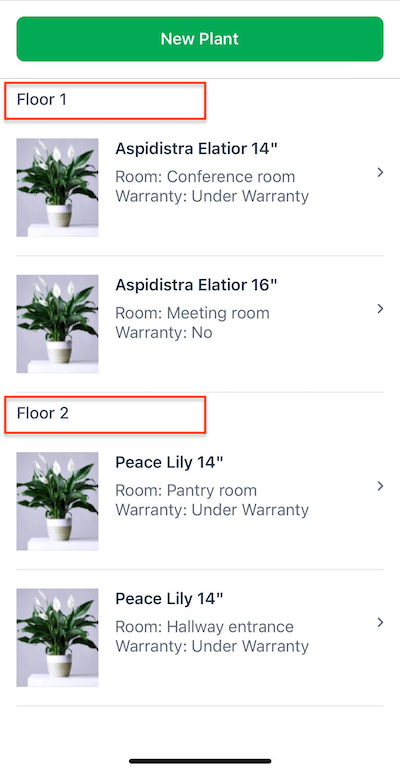
This property works the same way for both flat page components and list page components. See List Page Components for more information.
orderBy
The orderBy property controls the ordering of the items within the selector. This property is an array of strings that defines the properties that are used to sort the order of the items in the list.
Important
This property is not recommended when using an online data source. Online data sources should be ordered by the server-side query. This is because the data returned from the data source is paginated, and the ordering is done on the server-side.See List Page Components for more information.
Example
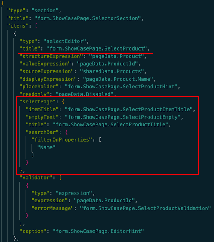
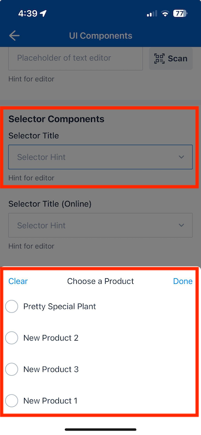
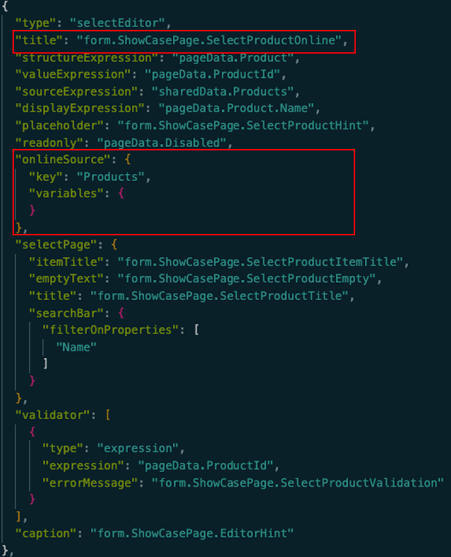
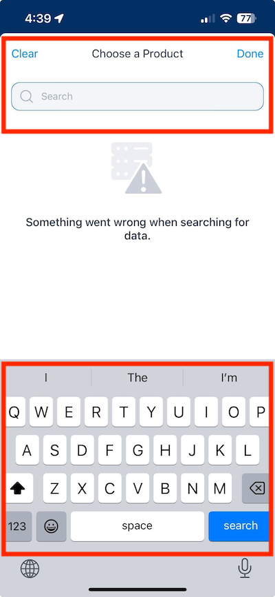
The following example demonstrates how the two select editors in the screenshot from the UI Components Showcase example form above are configured in the ui_def.json file.
The first selectEditor component is used to select a product from a list of products when the user taps on the field. The second selectEditor component uses a search bar to filter products from a list of products when the user taps on the field. The data is sourced from an online source.
ui_def.json
Select editor with a static list of products:
| Configuration | Screenshot |
|---|---|
 |
 |
Select editor with a searchable list of products from an online source:
| Configuration | Screenshot |
|---|---|
 |
 |
en.json
The corresponding localized strings for the above offline and online select editor options in the /static_resources/locales/en.json file are:
      "SelectorSection": "Selector Components",
      "SelectProduct": "Selector Title",
      "SelectProductHint": "Selector Hint",
      "SelectProductItemTitle": "${item.Name}",,
      "SelectProductEmpty": "No Products",,
      "SelectProductTitle": "Choose a Product",
      "SelectProductValidation": "Validation message",
      "EditorHint": "Hint for editor",
      ...
    }
  }
}
Feedback
Was this page helpful?