Date and time picker
Description
The dateTimeEditor component is a date and time picker component that allows users to select a date and time from a calendar and time picker.
The dateTimeEditor component has three modes:
- Date and time picker: Allows users to select a date and time.
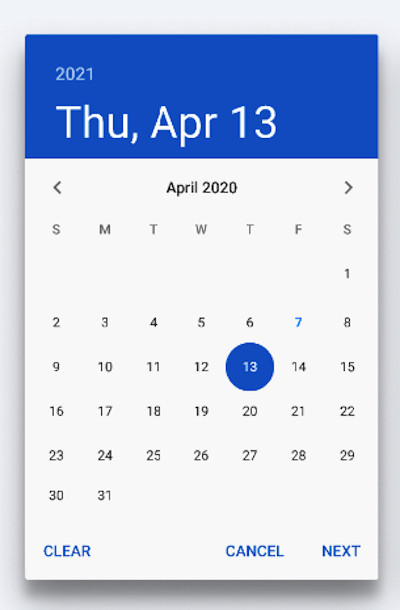
- Date picker: Allows users to select a date only.
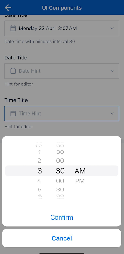
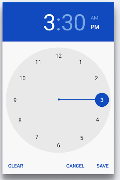
- Time picker: Allows users to select a time only.
For each mode, the time increment between options can be defined. Some examples of the different modes with different time increments, as they appear on an Apple iOS device, can be seen here:
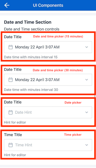
Date and time picker components
| Date time picker (15 minutes interval) | Date time picker (30 minutes interval) |
|---|---|
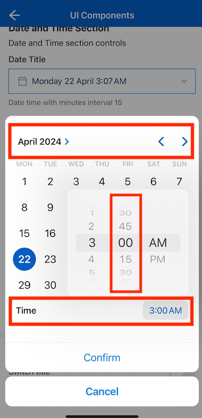 |
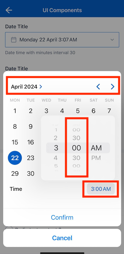 |
Date picker
| Apple iOS | Android |
|---|---|
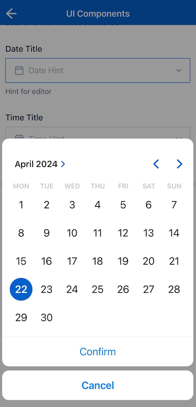 |
 |
Time picker
| Apple iOS | Android |
|---|---|
 |
 |
Note
These examples can be found in the Components Showcase form, which can be downloaded from the Skedulo Plus Examples repository.Properties
The following table lists the properties available for the dateTimeEditor component:
| Property | Description |
|---|---|
showIfExpression |
When the showIfExpression property is defined, it adjusts the component visibility based on the boolean value returned by the expression. |
valueExpression |
Defines the data context binding expression. |
placeholder |
The text displayed when the field is empty. |
mode |
The mode of the picker. The options are date|time|datetime. |
datetimeOptions |
Options for datetime mode. |
datetimeOptions.timezone |
Defines how the component handles timezones. Valid options are local | job | \none or undefined. |
timeOptions.minuteInterval |
The interval between minutes in the time picker. Valid options are 5| 10| 15| 20 | 30 | or undefined. |
Property usage
Timezone handling for the datetime mode
The datetime mode allows you to define which timezone the component should use. The datetimeOptions.timezone property is used to define how the component handles timezones.
Three options are available:
noneor undefined: Uses UTC time.local: Uses the local time of the device.job: Uses the job timezone.
For example:
"datetimeOptions": {
  "timezone": "none" | "local" | "job"
}
When communicating with the server, the component sends and receives the date and time in UTC format. The mobile extension front end then converts the date and time to the appropriate timezone based on the datetimeOptions.timezone property and displays this to the user.
Time picker minute interval
The timeOptions.minuteInterval property is used to define the interval between minutes in the time picker. The valid options are 5, 10, 15, 20, 30, or undefined. All other values are also treated as undefined.
The minute interval is configured as follows:
"timeOptions": {
  "minuteInterval": 30
}
Example
The following example demonstrates how the dateTimeEditor components in the example above are configured in the ui_def.json file of the UI Components Showcase example form.
ui_def.json
{
        "type": "section",
        "title": "form.ShowCasePage.DateTimeSection",
        "body": "form.ShowCasePage.DateTimeSectionDescription",
        "readonly": "pageData.Disabled",
        "items": [
        {
            "type": "dateTimeEditor",
            "mode": "datetime",
            "valueExpression": "pageData.FromDateTime",
            "title": "form.ShowCasePage.DateTimeFrom",
            "placeholder": "form.ShowCasePage.DateTimeFromHint",
            "timeOptions": {
                "minuteInterval": 15
            },
            "readonly": "pageData.Disabled",
            "caption": "form.ShowCasePage.DateTimeFromCaption"
        },
        {
            "type": "dateTimeEditor",
            "mode": "datetime",
            "valueExpression": "pageData.ToDateTime",
            "title": "form.ShowCasePage.DateTimeTo",
            "placeholder": "form.ShowCasePage.DateTimeToHint",
            "readonly": "pageData.Disabled",
            "timeOptions": {
                "minuteInterval": 30
            },
            "caption": "form.ShowCasePage.DateTimeToCaption"
        },
        {
            "type": "dateTimeEditor",
            "mode": "date",
            "valueExpression": "pageData.Date",
            "title": "form.ShowCasePage.Date",
            "placeholder": "form.ShowCasePage.DateHint",
            "readonly": "pageData.Disabled",
            "validator": [
            {
                "type": "expression",
                "errorMessage": "form.ShowCasePage.DateIsRequired",
                "expression": "pageData.Date"
            }
            ],
            "caption": "form.ShowCasePage.EditorHint"
        },
        {
            "type": "dateTimeEditor",
            "mode": "time",
            "valueExpression": "pageData.Time",
            "title": "form.ShowCasePage.Time",
            "placeholder": "form.ShowCasePage.TimeHint",
            "readonly": "pageData.Disabled",
            "validator": [
            {
                "type": "expression",
                "errorMessage": "form.ShowCasePage.DateIsRequired",
                "expression": "pageData.Time"
            }
            ],
            "caption": "form.ShowCasePage.EditorHint",
            "timeOptions": {
                "minuteInterval": 30
            }
        }
        ]
    },
en.json
The corresponding localized strings in the /static_resources/locales/en.json file are:
{
    "form": {
        "ShowCasePage": {
            "DateTimeSection": "Date and Time Section",
            "DateTimeSectionDescription": "Date and Time section controls",
            "DateTimeFrom": "Date Title",
            "DateTimeFromHint": "Input Date Time From",
            "DateTimeTo": "Date Title",
            "DateTimeToHint": "Input Date Time To",
            "DateTimeToCaption": "Select a date and time",
            "DateTimeFromCaption": "Date time with minutes interval 15",
            "DateTimeToCaption": "Date time with minutes interval 30",
            "Date": "Date Title",
            "DateHint": "Date Hint",
            "DateIsRequired": "Validation message",
            "Time": "Time Title",
            "TimeHint": "Time Hint",
            "TimeIsRequired": "Validation message",
            "EditorHint": "Hint for editor",
        }
    }
}
Feedback
Was this page helpful?